Half of the people in my data visualization workshops don’t even realize there’s a style guide lurking around somewhere in their organization, but chances are the Communications department has been begging people to use the style guide all this time.
One big reason more folks don’t adhere to the company style guide – or even know that it exists – is because it doesn’t have all the guidance they need.
Style guides are a gift – the people who put them together have already made some difficult decisions that guide your graph-making. This is the document where you’ll find the exact colors you should be using in your charts. If you’re lucky, you’ll also find details about font sizes. Awesome! This takes out the guess work and makes it such that everyone’s viz looks the same. And THAT brings you cohesion and consistency.
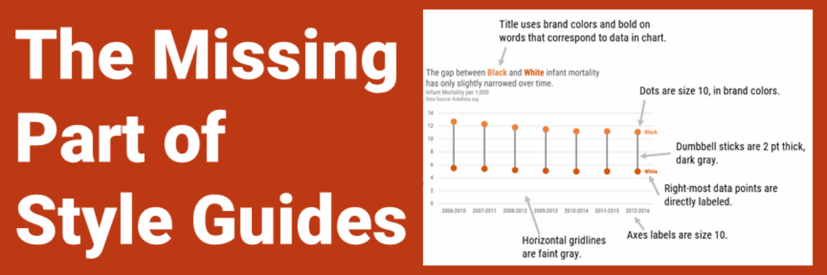
BUT – most style guides don’t adequately address data visualization.
Here’s a visual of what I mean:

The more you can be reallllllly specific about how the charts should look, the more that everyone’s chart will look the same. Brand consistency!
Even better is if you can construct the example charts so they are templates, essentially finished, where a team member can just edit the data and be done.
I’ve ushered in data visualization style guides with many organizations and let me tell you: It takes team work.
Because I often see conflicting needs that the other group doesn’t know about – until they talk and align.
For example, the Comms team usually dictates a primary font, usually something custom, and a backup font, like Arial. But the data people who follow my advice know that our graphs are best when they use a condensed font. When data people don’t see a condensed font in the Comms style guide, they go rogue and pick whatever they like. And then there isn’t brand consistency and y’all don’t look like you have it together. Because you don’t.
Instead, the data people gotta sit with the communications people and ask for a condensed font that cooperates with the other fonts in the general style guide.
Comms people don’t typically work with graphs so they won’t know how the decisions around fonts, font sizes, and colors impact dataviz unless the data folks speak up.
It helps if you can see some models to follow. I look to Amy Cesal for guidance here. She’s developed many data viz style guides that are publicly accessible. Read about her work here and check out the collection of data viz style guides here.

