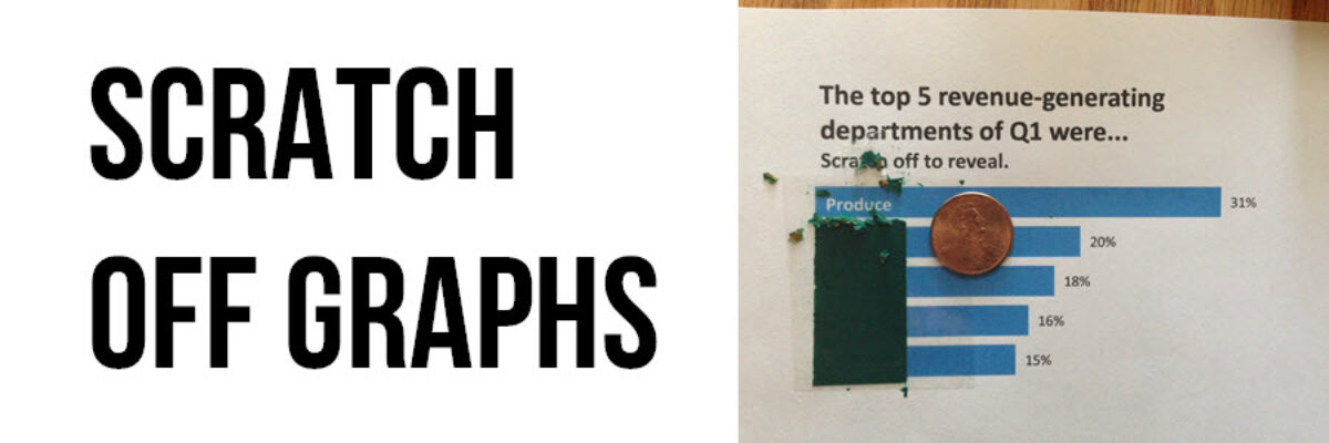
Scratch-Off Graphs
A couple of weeks ago, I got an email asking me for ideas about ways to make evaluation findings more exciting and interesting. I know, some of you are thinking, “aren’t they always exciting and interesting???” but alas it isn’t the case. This idea wasn’t appropriate for the emailer’s particular situation, though it might be right for yours: scratch-off graphs.
First, make the graph as normal, using what you know about best practices in graph design. Note that I added a subheading that directs the recipient on how to interact with the graph. Hint: the thicker the paper, the better. Think cardstock or postcard stiffness. Another hint: the shinier the paper, the better. The paper I used was regular printer paper, so I first put a piece of clear packing tape over the labels to give it a slick surface.
Then I painted over the bar labels & clear packing tape using a scratch-off paint mix. To make scratch-off paint, mix 1 part dish soap to 2 parts acrylic paint. Hint: the darker the paint color, the better.
Even with dark paint it’ll likely take 2 coats to cover the labels completely. You’ll need drying time between coats, so plan to revisit this project over a couple of days.
Once the paint is dry, it will scratch off with a coin.
Imagine mailing these on postcards to your evaluation stakeholders. Both the snail mail and the scratch off make this delivery of evaluation findings intriguing and memorable. You could even spread the cards around on the boardroom table during your dissemination meeting. The point is to generate some mystery and curiosity about what lies beneath the paint and then give the stakeholders the agency to discover the answer.
Interested in learning more about great graph design? Check out my upcoming webinar on Smart Data Visualization.


