Reviewing Datawrapper
Have you tried out Datawrapper? The Guardian uses it for their data visualization reporting (learned after reading through lengthy but amusing comments and semi-argument on Few’s blog) so I figured it was worth checking out.
Datawrapper is primarily used to embed graphics in a website, like this.
[iframe http://charts-datawrapper.s3.amazonaws.com/YB8RY/index.html?rev=4 600 400]
Cool!
There are clear advantages over a more static graph produced in something like Excel: embedability, interactivity, and vectorization (i.e., a static version of the picture can be infinitely resized and it won’t lose it’s clarity, which is great for display in something like a slideshow). Also, and importantly, Datawrapper is free and open source.
Less cool.
Now, I have just the simple online account. Which means my data is stored on their server. I’m using public data here for a local evaluation I’m conducting, so the security of the data is not a super big deal. If it matters for you, you’ll want to get the version that you store onto your own server. Here’s where things get complicated. To store it on your own server you have to navigate through Github and have these prerequisites:
- Apache (with mod_rewrite and .htaccess enabled)
- PHP > 5.2
- MySQL server
While these tools are becoming more and more common, things quickly got over my head and I’ve temporarily abandon the effort to get my own version installed.
Cool!
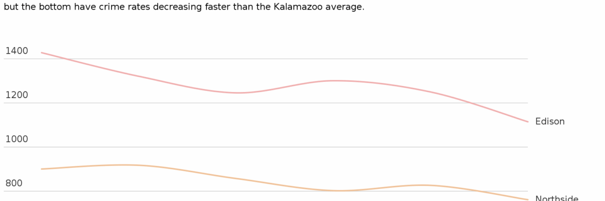
When you set up an account, even with the online free version, you can use one email and password and your whole team can access charts that have been made and develop new ones. What impressed me so was that the graph creation process was super fast. I mean, it is fast with Excel, too but then you spend all your time tweaking Excel’s default graphs to get them to look like something reasonable and easy to engage with. In Datawrapper, those tweaks ARE the default setting. See how my lines are directly labeled? See how one line is emphasized (that’s the neighborhood where I live)? See how I have a left-justified title and subtitle? Those are built-in features of Datawrapper. Sweet.
Less cool.
Customization of colors and fonts and getting rid of that damned Created with Datawrapper line at the bottom are not easy. In theory, colors can be changed when building the graph but I could not get this to work for me. Other alterations require the server-installed version.
Cool!
This is a lot like Tableau in that the design of the final product is leaps ahead of Excel. But unlike Tableau, the learning curve to making your first graph is very very small. Unlike Tableau, it is free. And unlike Tableau, even using the online-only version does not publish your data to a public gallery. In short, Datawrapper is worth a try (and certainly worth having your IT people read the server installation instructions – if it makes sense to them, you’ll be good to go).


