Review: Napkin Sketch Workbook
An anonymous sweetheart sent me a copy of Don Moyer’s Napkin Sketch Workbook in the mail yesterday. I read it in one sitting. I’m not sure if it wasn’t meant for me to review, but seeing as how this is an unsanctioned blog, let’s do it anyway.

The workbook’s overall premise is that visualizations are pretty important in conveying information and creating understanding. He also rightly distinguishes visualization of ideas (the topic of this workbook) from data visualization (the topic of lots of other books and sometimes this blog, too). For the timid, there are super helpful “classic” visualization strategies – such as showing a hierarchy or a timeline – that provide a structure to work within.
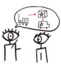
The co-big idea of the book – and the reason I like it soooo much – is this: Anyone can draw. Even you. Even me. The annoying part of the workbook is the patronizing step-by-step explanation of how to draw a stick figure (and are we still using skirts for women, really?). But Moyer does it with such humor and simplicity that I found myself chuckling along. In fact, it served as perfect inspiration for a talk I was preparing this morning. Here’s a sneak peek of a visualization I made – totally inspired by the workbook – showing how graphics assist keeping information in long-term memory.
 While Moyer doesn’t specifically speak to evaluators, I can totally attest to the role of hand drawn visualizations. It’s been used more than once in an interview, when the interviewee had to draw her answer. I used it once to depict dose-response ideas to a prospective client, who talks about that drawing to this day. As evaluators, we deal with a lot of complex information and sophisticated (or complicated) methodologies and analysis techniques. Drawing and visualization are awesome tools to help us translate those concepts into a succinct and accessible format.

