Report Layout in PowerPoint?
I was recently workshopping with a group of evaluators who had bravely submitted their work examples for group critique. In one instance, they had admitted that what I thought were text-heavy slides was actually a full written report. That’s right – they’d used PowerPoint for written report layout. Mind. Blown.
Then I started asking around. As it turns out, this is somewhat common. People find PowerPoint immensely easier to work with, particularly in terms of arranging text and graphics, than Word.
I get it. Totally. Evaluators don’t have time (or money) to learn fancy new software programs that make report layout simple. We’ve gotta work with what we have. And if it’s all going to end up as a PDF anyway, I suppose the software doesn’t make much of a difference. Just be sure to pay attention to two things:
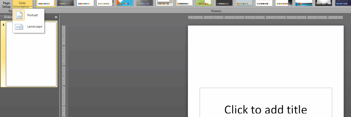
1. Long reports need to be presented in portrait orientation. And this is possible in PowerPoint. Here’s a screenshot:
You can actually turn the orientation of your slides so that it looks more like a written report. In PowerPoint 2010, this is under the Design tab, within the Slide Orientation setting. Pretty cool, eh?
Why is this so important? Well, we are used to seeing slides in landscape (and the occasional chart or table) but we are used to reading long text in portrait orientation. And if we want people to be able to pay attention to what we are saying, rather than get distracted by internal questions like “Is she trying to give me a full report on PowerPoint slides?”, we have to work with the familiar.
2. Because PowerPoint works through textboxes, evaluators need to make sure the narrative text is set at an appropriate length.
Headers, call out boxes, and graphics are places where one can stretch the boundaries of margins in PowerPoint a bit more. But when placing the narrative text, it should be done such that the lines are no more than 8-12 words per line. (That’s 50-80 characters, depending on the font, for you folks that like to labor in long words.)
When our lines are longer than that (super easy to do when filling a landscape-oriented slide with a textbox), it gets difficult for the reader to track the text. Tracking the text is when a reader tries to finish one line and start the next. When the lines are too long, readers mistrack often, getting confused about which line is the next (and this interrupts comprehension and works against our intentions as evaluators).
So I’ll remain agnostic about the proper software program for report writing, as long as we can agree to pay attention to the components of legibility and comprehension research wherever we are.


