The theme of this blog post can be summed up with one emoji: >.< If you aren’t emoji-fluent, that’s the facepalm, a gesture made when you are internally dying of embarrassment over someone’s incompetence. In this case, that someone is me. I have failed to recognize when I was using…
Search results for: excel
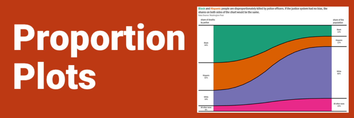
Proportion Plots
Proportion plots help us compare the share of a population between two metrics. It uses length on the left and right side of the chart and connects the lengths by a band in the middle that swoops a lot if there is disproportionality and stays pretty even if the proportions…
Communicating Data is About Handling Egos and Emotions
Behind every furrowed brow and annoying question about your slide is someone’s ego getting dinged. People don’t like their egos dinged. This tiny bit of emotional intelligence will give you massive insight into how to handle tough data communication scenarios we all find ourselves in at one point or…
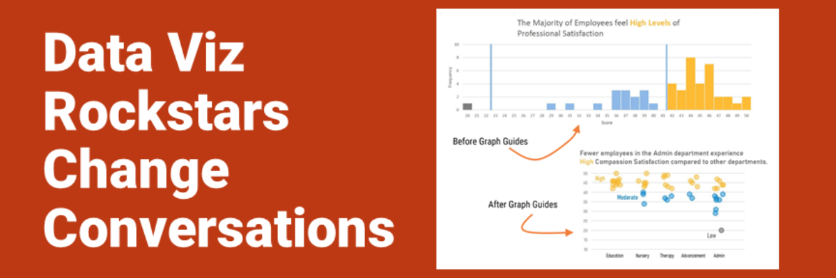
Data Viz Rockstars Change Conversations
Audrey Juhasz has been in The Evergreen Data Certification Program for about 4 months. In that time, she has learned some super do-able and highly effective lessons that have totally changed the way she and her team are able to talk to each other. This data viz rockstar is changing…
So What?
In the introduction to our dataviz workshop at a Fortune 50, the Chief Operating Officer told the room of his employees that he was looking forward to seeing their work improve as a result of what they learned with us. Because, he said, what they wanted to see on the…
Asked and Answered: Visualizing Ranking Data
This blog post is part of a series called Asked and Answered, about writing great survey questions and visualizing the results with high impact graphs. Dr. Sheila B. Robinson is authoring the Asked series, on writing great questions. Dr. Stephanie Evergreen is authoring the Answered series, on data visualization. View…
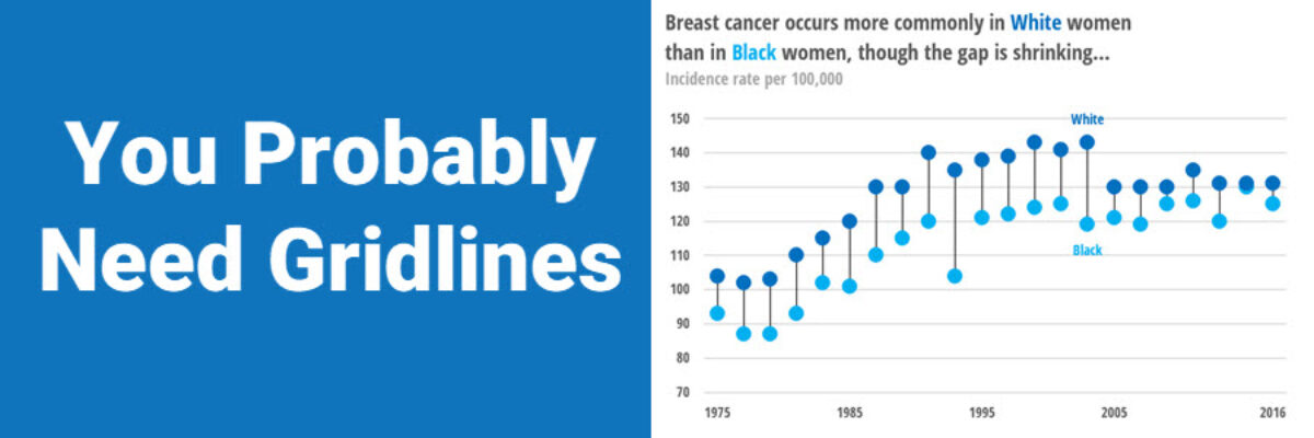
You Probably Need Gridlines
A while back, I published a blog post on how Better Charts Tell Clearer Stories, in which I made over some breast cancer data from Komen into this graph: and when I posted this image on Instagram, someone commented that they didn’t understand why I had used gridlines, apparently…
Asked and Answered: Visualizing Check All That Apply
This blog post is part of a series called Asked and Answered, about writing great survey questions and visualizing the results with high impact graphs. Dr. Sheila B. Robinson is authoring the Asked series, on writing great questions. Dr. Stephanie Evergreen is authoring the Answered series, on data visualization. View…
Announcing The Evergreen Data Certification Program
Have you ever signed up for an online course with really good intentions, only to find yourself barely checking in a couple months later? In The Evergreen Data Certification Program, we will not let you fade away. When you commit to The Evergreen Data Certification Program, you earn a…
Calling the Data Viz Curious
Ever spot those gorgeous graphs in the New York Times or the Washington Post and wish you could make them? You can. And you don’t need fancy software to do it. Good graphs, at their core, are based on a few fundamental principles of data visualization design, a structured…
