WE AREN’T JUST HERE TO LOOK PRETTY. Evergreen Data is a cross-industry data visualization and design firm, grounded in research-based best practices. We know data. We know design. And we know what feeds real-world, action-oriented, data-driven decision-making. We are here to partner with people who want to…
Search results for: excel
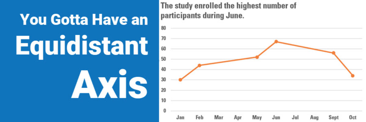
You Gotta Have An Equidistant Axis
Here’s the thing: The scale used on each axis must have equal intervals. It’s an easy mistake to make. Excel automatically spaces your intervals and labels equidistant from one another but it is assuming that your intervals actually are equidistant. In this graph, that’s not the case. We are missing…
Announcing The Chart Starter Series
So, hey, heads up: The Chart Starter Series is probably not for you. If you know my work well, you are probably already a dataviz whiz. The Chart Starter Series is for your colleague. You know the one. The one who keeps asking you to make their graphs. Tell…
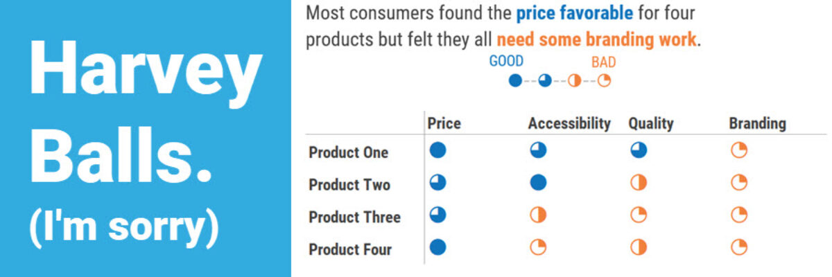
Harvey Balls
I’m guessing that 90% of the people who search on “Harvey Balls” and end up on this blog post are not here for the same reason I’m here. I’m here to talk to you about qualitative data. And this one can be a little NSFW. Harvey Balls are an…
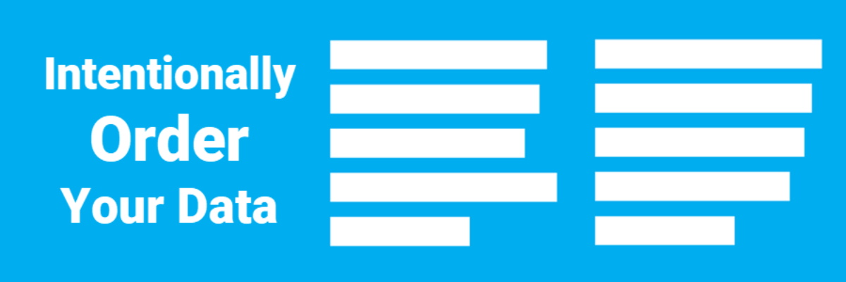
Intentionally Order Your Data
Listen, no one cares about the order we listed the response options on the survey. But most graphs, especially those automatically generated from survey software, showcase the data in that order. And that isn’t useful for anyone trying to interpret the data. Instead, place the bars in order from…
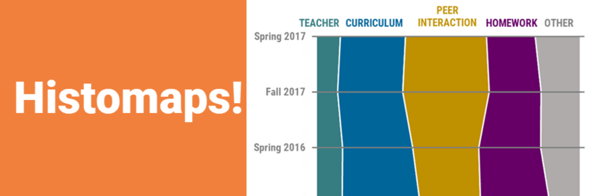
Histomaps
The histomap is one of the oldest, and most famous, ways to present qualitative data over time. The first example was created by John B. Sparks in 1931, titled “The Histomap: Four Thousand Years of World History.” At the time it was printed, the chart was marketed as a clear,…
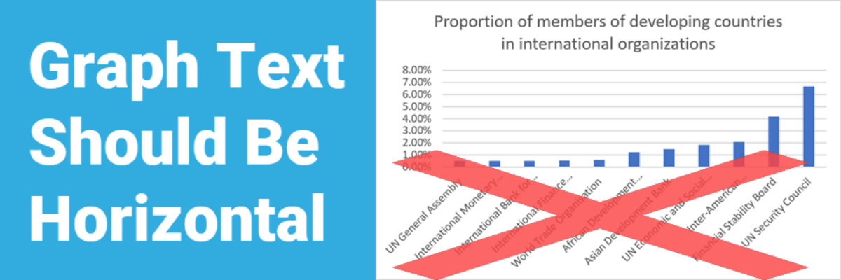
Graph Text Should Be Horizontal
In languages based on the Latin alphabet, we read horizontally, from left to right. Reading on a diagonal produces cramped necks. Reading vertical text is just not going to happen. So, as much as possible, the text in our graphs should be horizontal. Let’s walk through a demo. I was…
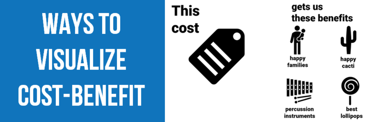
Ways to Visualize Cost-Benefit
Cost-benefit analysis a way of saying “Yes, this program has great impacts… but it’s super expensive.” You’ll often hear the results of cost-benefit analysis in the news, phrased as “For every dollar we spend on this program, we save $$$.” Clients at the University of Alaska, Anchorage (I HAVE THE…
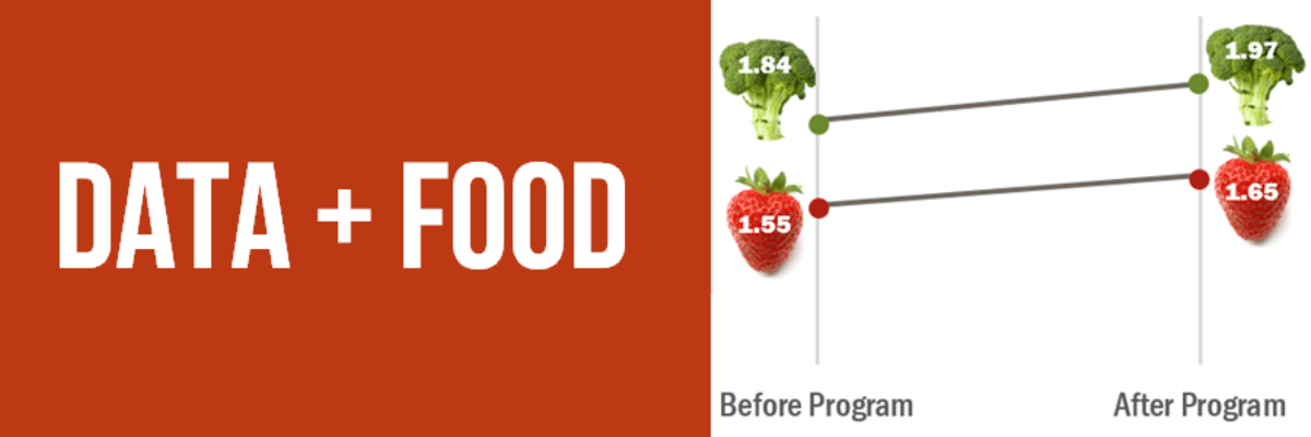
Data + Food
I like to think I’m a foodie but actually I just love to eat. We all do! Food gets people to the meeting. Food grabs folks’ attention. Food gets people talking (between bites, let’s hope). So let’s play to the player and figure out how to get people engaged in…
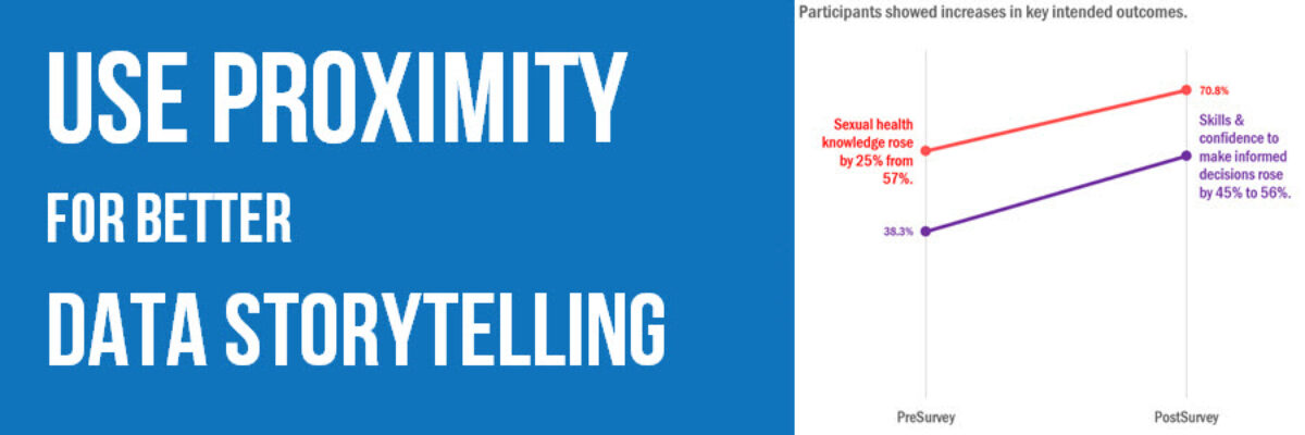
Use Proximity for Better Data Storytelling
Recent clients, Planned Parenthood Federation of America, faced a design problem so common they didn’t even know it was a problem. They were working on communicating some data from a program that aims to educate on healthy sexuality and reproductive health. They surveyed participants at the start and end of…

