No More Red Yellow Green

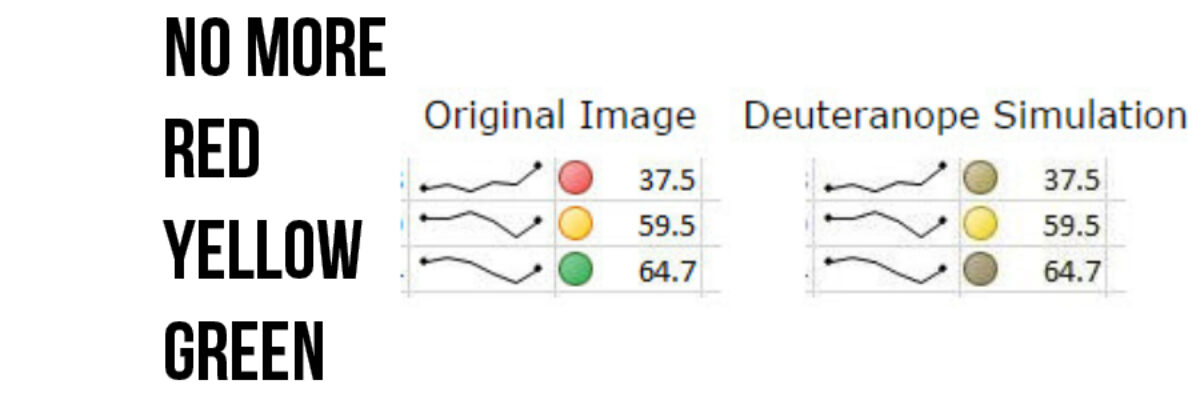
Listen we absolutely must stop using the stoplight color system in our data visualizations and dashboards. You know what I’m talking about. It’s stuff like this: and this It’s the worst thing ever. For several reasons. Here’s they are: The red-yellow-green color coding system isn’t…

Read More

508 Compliance & Data Visualization

508 Compliance became A Thing to Deal With in 2000 and 15 years later people still have questions about how it works. I get questions about how to be 508 compliant in nearly every workshop. 508 compliance essentially means that people who produce things on the web for any federal…

Read More

Three Ways to Show Down is Good

Humans in the western culture tend to see things that trend upward as positive and lines that trend downward as bad. But what if bad is good? And not like my college boyfriend. But in the sense that a decrease is a good thing. Let’s use the example of weight…

Read More

How to Make a Short Report a Billion Times More Engaging

Anna Harms knows when the jig is up. Part-way through my 1 day workshop on Presenting Data Effectively, she knew what change had to happen (and fast). So fast, she didn’t hesitate to walk right up to me and say, “We are working so hard on our reports but there’s…

Read More

Visualize Branching Questions with Nested Area Graphs

This, my friends, is a nested area graph. I got this idea from the smart people at Innovation Network. And it is super amazing at visualizing the sequence of survey questions that branch. The kind where it says “if you said Yes, proceed to question 32” and stuff…

Read More

Stop Asking if the Slides are Available

The thing is, if the presenter has done a great job, you really don’t want the slides. No really, you don’t. A long long time ago, Garr Reynolds taught me that if someone can look at your slideshow and tell all the things you are going to say, there’s no…

Read More

My 2014 Personal Annual Report

Holy smokes it’s been a big year! I finished up my last workshop of 2014 last week and as I got into the cab to head to the airport, a wave of major sleepiness hit me hard. I’ve been super crazy productive and worked with some of the most amazing…

Read More

Visualizing Likert-type Data: Try Aggregated Stacked Bars

Man, do researchers love Likert-type data! You know what I mean – the kind of survey response options that range from Strongly Agree to Strongly Disagree (or vice versa, depending on your allegiances). Probably the most common way of visualizing that data is via a stacked bar chart, just like…

Read More

Evergreen Evolving

I took a deep breath and I did it. I changed my Twitter handle. This is a big deal. Things sure are evolving around here. It goes like this: I fell into the field of evaluation. Like most people on the planet (including my parents), I had no idea what…

Read More

Adding a Benchmark Line to a Graph

This simple line packs so much power. Adding a benchmark line to a graph gives loads of context for the viewer. Here’s how to make one right inside Excel. It’s so easy you might pass out. My data table looks like this: I have my data and I have the benchmark…

Read More