Makeover: Health Data Edition

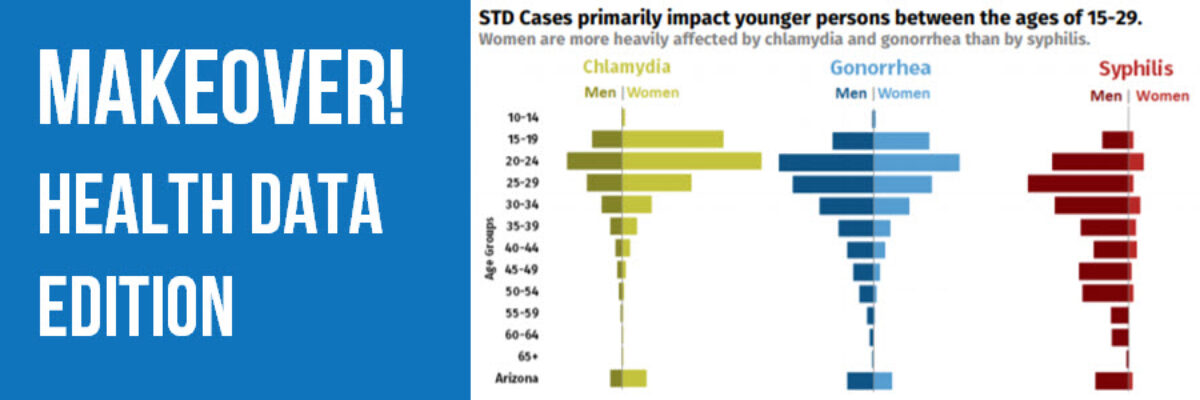
By far, my favorite emails to receive are from clients bragging about the beauty and impact of their work after our workshop. I just got one of these the other day from Becca Scranton at Arizona Department of Health Services. After thanking me for the workshop, she wrote, “Thanks to…

Read More

Spectrum Displays

When presenting qualitative data, choose visuals that are broad enough to display the full set of data but are also visualized in a way that allows viewers to pull stories from the data. This is a hard balance to strike, and a spectrum display can do so very well. A…

Read More

Evergreen Collections

The end of August marks an important moment for me because it is when I quit my salaried job to work on data visualization and design full time. 5 years! It remains one of my best decisions. So, I like to celebrate it with you. Last year, I launched the Evergreen Data…

Read More

Visualizing Not Applicable or Missing Data

Yes, I know the jig is up. All of my examples in books and workshops are pretty tidy, as if every response options was addressed by every single respondent. The truth is that life and data collection are messy. How can we show that different questions have different sample…

Read More

Color Psychology

As I usually do in my workshops, I talked to a group in Warsaw, Poland about how we should use color intentionally in our data visualization and that, in fact, the color choice itself can help us tell our story. I prepared a little activity around this issue, in…

Read More

Easy, Simple One Page Handout

Few things are more tragic than excellent non-profits doing great work to help struggling families but can’t tell their story effectively. In this blog post, I’m going to step you through the redesign of a one page handout I created for my clients at the Education Development Center. Their…

Read More

Interactive Heat Maps

One of the most common ways to analyze qualitative data is through thematic coding. Thematic coding allows us to move beyond the visualization of word or phrase frequency, like in a word cloud, and start to examine attributes and stories that emerge from the data. The New York Times…

Read More

Adding Confidence Intervals to a Dot Plot

Evergreen Data Visualization Academy member Dana McGuire recently wrote me to ask about her dot plot. She said, “Would there be a way to show the bar or confidence interval somewhere? I have gotten positive feedback on the look of the graph overall, but it is a scientific conference…

Read More

Qualitative Data Visualization: The Gauge Diagram

When we debuted our Qualitative Chart Chooser, we promised to dive into detail on specific visualizations, so let’s kick it off by discussing how and when to use one of the most derided charts of all: the gauge diagram. I know, I know… I am sure you are…

Read More

Two Alternatives to Using a Second Y-Axis

Almost as often as I see a pie chart with a hundred tiny slivers, I see line graphs using two y-axes. And it is just as bad. Graphs like this appear in every industry, everywhere I consult all around the globe. Using two y-axes is not a great idea…

Read More