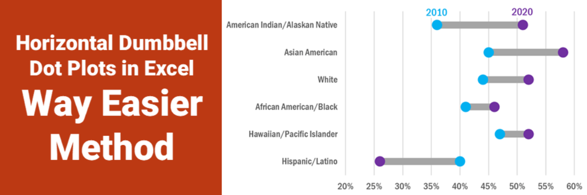
Ok, babes, prepare to be amazed. It used to be that making this viz was pretty tedious but I’ve recently refined a totally new hack (thanks to a lollipop chart example provided by Sevinc Rende, one of my mentees) that makes this soooooooo easier. It used to be Rockstar…
Search results for: excel
Excel vs. Tableau vs. R
We are hard core believers that you should become the master of the tools you own. If your company relies on Microsoft, figure out how to use Excel to make amazing data visualizations. If your company invested in a site-wide license for Tableau, climb over that learning curve and master…
Make a Pictogram in Excel
This graph type goes by a lot of names: isotype chart, pictograph, or pictogram. Whichever way, it allows us to use symbols rather than stick with the squares that make up the waffle chart. And it is especially well suited to representing small counts of things that can otherwise be…
Super Fast Small Multiple Graphs in Excel
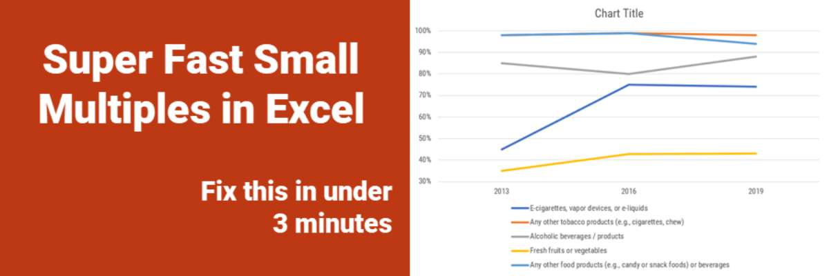
Every time I show this trick to even veteran Excel ninjas, their heads explode. So you have probably heard me preach the gospel of small multiples once or twice before. Breaking a clutter-y graph into a lot of smaller graphs that show one piece of data at…
How to Make Dumbbell Dot Plots in Excel
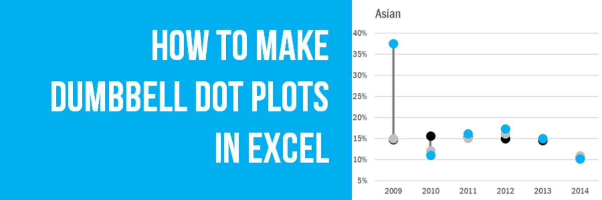
Data visualization is so cool because it helps you see things that would otherwise take a looooooot of effort. Here’s an example. Some very sweet clients in Maricopa County, Arizona (that’s the greater Phoenix area, friends) had a habit of presenting super important data in the most hard to digest…
How to Show Ranking Data in Excel
Danielle, a member of my Evergreen Data Visualization Academy, submitted a question to our monthly Office Hours webinar about how to show ranking data. She sent this survey question: There are eight categories below. Rank each item to continue to the next page. Rank the following services in order…
How To Build Data Visualizations in Excel
When I show people a dot plot, the first thing they say is “Cool, but how do I make that?” and this page has all your answers. From time to time I publish blog posts with step-by-step directions on how to make amazing visualizations right inside Excel and I’ve…
Exporting Graphs from Excel
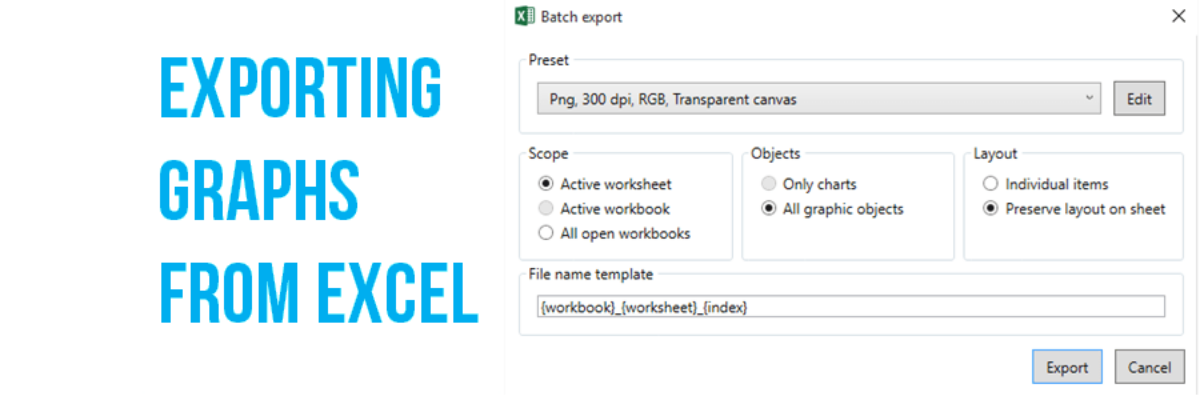
I love when readers send me questions that I can turn into blog posts. The question: We often make our graphs in Excel and pop them in to reports or slides, but the transfer usually causes the formatting to get all wonky. How can we get print-quality graphics out of…
Make A Lollipop Graph in Excel
The simplest way to show many types of data is through a column or bar chart, ordered greatest to least. These will work just fine, most of the time. When do they fall short? Well, when the values are all high, such as in the 80-90% range (out of 100%). Then…
Make a Slopegraph in Excel
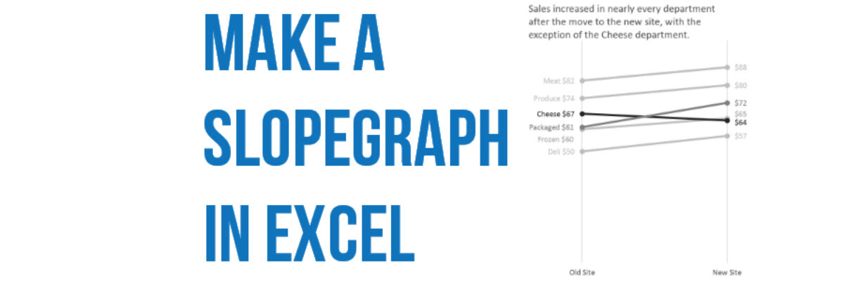
Slopegraphs are a newer graph type with powerhouse capabilities. They rely on Excel’s line graphing feature but they don’t necessarily have to show change over time. Slopegraphs play into our ability to judge slope fairly well. For this reason, they are perfect for highlighting the story of how just one…
