One Free Pie Chart
If I could, I’d ban pie charts. Not because they are inherently bad, but because most people don’t know the pie chart’s tiny range of acceptability. Here it is: Pie charts are ok if you don’t need the numbers on the wedges to get the story. That usually means you’ll be limited to very few slices. And you’ll need a great title. The largest slice starts at noon and the rest go in descending order, clockwise around the pie.
When I say these rules in my data visualization workshops, I see some people transcribe them in their notes, word for word. And I know these people are never, ever going to give up their pies. You probably have that colleague that just can’t quit the pie. Maybe its your boss and you hate to push back too much. Maybe its YOU.
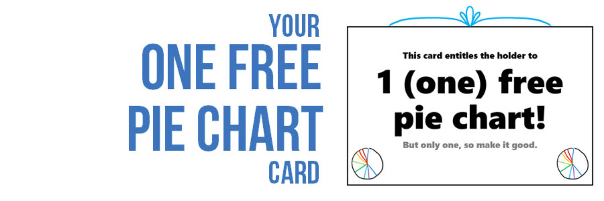
So, just for you pie lovers, may I gift you with this pass for one pie chart:

I can respect a deep commitment, so have at it. But just once. One pie. One wacky pie chart among other really fantastic data visualizations will not hurt (too much).
Print this out and give it to your pie lover. Just right-click on the free pie card image, save it somewhere, and print.


