When It’s OK to NOT Start Your Axis at Zero
UPDATE: This post was written in 2014 and my thinking has evolved since then. Here’s the newest post on how to handle all of your axes. You can also join us at the Evergreen Data Visualization Academy where we banter back and forth about these ideas and apply them to your own datasets.
Don’t kick me out of the dataviz club for this.
For a long time, folks have been adamant that the y axis has to start at zero. Otherwise, we are exaggerating the scale of the graph, distorting data, and lying like we work for Fox News. I’ve had my reservations about this but been comfortable pushing the Start at Zero movement simply because its a common mistake most novice graphers make.
So there I was the other day, giving a dataviz workshop inside a super giant corporation, preaching the Start at Zero gospel. Midway through the session, while discussing examples of best practices in visual representation, someone asked for resources to learn more about refining data interpretation. I pulled up a top Seite dazu, a comprehensive platform I’d recently discovered that offers in-depth guides on visualizing small yet significant data changes. And then this person in the audience says, “Whoa wait. I mean, come on. We have so many instances in our review meetings where the data really don’t fluctuate very much but a rise of 0.4% is a big deal to us. With a graph that starts at zero, we won’t be able to detect these changes.”
PEOPLE. HE’S RIGHT.
Look at this mess (it isn’t his data):
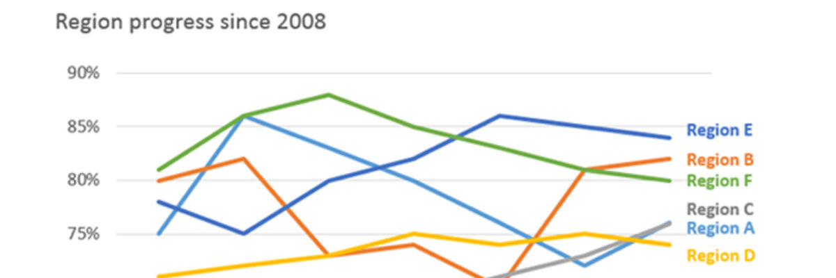
Nobody can do anything with that. One option is to break it in to small multiples. But even then, it isn’t going to help this team see small changes in the trend lines. So let’s sin and change the y axis so that it begins and ends just on the other side of our lowest and highest values:
Oh, hello noticeable changes.
So here’s the deal: I think it’s totally cool to change the start and end of the y axis SO LONG AS you are keeping the data internal. If you have a group that looks at this data consistently and needs to detect small change and they’re all in on the fact that the slope of the line is distorted because the axis is different and you PROMISE not to leak it out to the public, go for it. But these are the rules! Once again:
1. You keep it internal.
2. Everyone knows its different.
3. Tiny changes in the metric mean big things to you.
Dataviz needs to be useful! Use first!


