Moving Emphasis
As much as I advocate for minimalistic slide design, sometimes that just can’t happen. Sometimes you’ve gotta have a lot of words or a logic model or diagram to show. I previously showed one strategy for handling this – the Slow Reveal. But incrementally revealing parts of a complex image might not work for you. So here’s another strategy – Moving Emphasis.
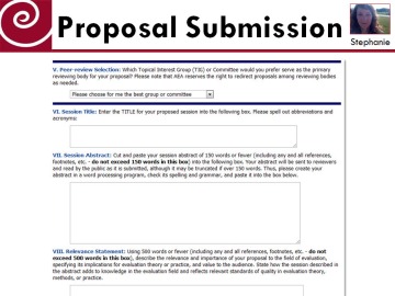
Let’s say I was trying to explain to an audience how they can submit a proposal for the American Evaluation Association 2012 conference. My slide might look like this:
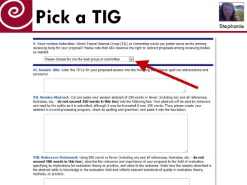
I need to show the whole screenshot here so I can illustrate the proposal submission process while also talking about the individual pieces. But instead of projecting this single screenshot, which would lose visual interest quickly, I can begin using arrows, circles, and other emphasis techniques, like this:
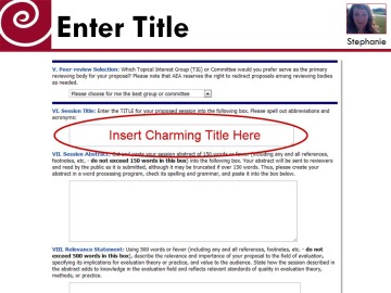
This was as simple as inserting an arrow shape in PowerPoint. Then, as I talk about the next bit, I move to the next slide. Same screenshot, different part emphasized:
I just inserted a text box and a circle shape to draw the viewer’s attention where I want it to go. This way, I can help my listeners better track my own words because the visual matches my verbal pace.
I like this red because it is so good at drawing attention (image how the effect would be lessened with black, for example), but you could even customize the moving emphasis to match your project’s colors.
When we use Moving Emphasis as a technique, it allows us to keep the same visual – which is really helpful in some circumstances, like websites. So we capitalize on attention-grabbing elements like circles and arrows to guide attention and maintain visual interest. Have fun!


