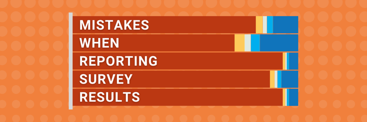
This list is entirely derived from my own mistakes.
It’s no joke to invest in a consultancy to survey a population, analyze that data, and (fingers crossed) give you some helpful information that makes you better at serving your people. It’s a ton of time and money. So those of us who develop and run the surveys better not screw up the reporting.
But I did. Many times. I simply didn’t know there was a better way. So learn from my mistakes:
Presenting the data in the order the questions were asked
Back in my PhD program, we ran a ton of surveys. Lots of smart psychometricians on our team. And they’ll teach you that you should always ask your demographic questions first. That way, if someone quits mid way through your survey, you can still disaggregate on the questions they did answer because you captured the demographics at the beginning.
Then you move to subject matter questions that are easy to answer, so people don’t get intimidated, and you work your way to the more complex questions. The ones your survey sponsor really wants to know.
That order might work for your survey respondents.
But it isn’t as effective when you report the results back to your survey sponsor (aka your audience). They don’t want to wait 30 minutes while you discuss the less interesting responses before you get to the good stuff.
When your survey software generates one chart per question (in a mediocre graph type, by the way) you can’t just copy/paste those visuals into your PowerPoint and call it a day.
Just showing the survey taker demographics
I used to do this. I’d make one chart per question and put them into the report in the order they’d been asked. Which meant I was giving my audience 10 pages of pie charts, one for each demographic question, and I’d exhaust their interest before we ever got to the good stuff.
People don’t want to just be shown the demographic data. I’m talking about stuff like this:

At best the audience reads this and goes “ok.” There’s just not anything really meaningful in here to do anything with.
This PowerPoint (not mine) had 18 slides on demographic questions. 18 “ok”s. Few people are going to have interest left at the end of that.
Instead, just summarize the respondents in a couple sentences. Or use your slide title to write a story about respondent demographics, like “Most of the respondents were over the age of 25, which matches the clientele we serve.”
Showing every single survey response
It’s ok to put boring data in the appendix. Not every question is gonna turn out to be a banger. It’s ok. You’ll still have a job.
Where you job comes into jeopardy is when you spend half your meeting showing your audience dud after dud.
Edit your reporting. For example, start off with the 5 biggest increases and decreases since last year’s survey. Or the 3 questions with the most surprising responses. Or where you saw the largest differences when you disaggregated on those demographics.
Those are the topics that’ll generate conversations and motivate some changes to better serve the clientele.
Tiny slivers in your stacked bars
Yeah, it’s common practice to ask your survey respondents to rate their answers on a 5-point scale, like Strongly Disagree to Strongly Agree. Heck, the more points on your scale, the happier your local psychometrician because they have more variability to play with. That’s why you’ll see 7-point, 9-point, and even 100-point scales sometimes.
But that’s gotta be balanced by the practical reality for your survey respondents. Do they really know how to discern the difference between an 8 and a 9 on a 10-point scale? Meaningfully, no.
Even with some 5-point scales, I often run into situations where all the survey respondents just freakin love this non-profit and nearly everyone has marked “Agree” or “Strongly Agree.” When we don’t think carefully about how we present that data, we can end up with a hot mess like this:

One solution: Aggregate some of the negative and/or positive responses larger groups. Perhaps diverge the dataset.

Check out other solutions here.
When you avoid the mistakes I used to make, your audience will be set up to actually make use of your data and take action.
