Kuler/Color
Here’s a procedure I use all the time to help me select color combinations for my reporting. It makes use of this great, free, online program that takes all the scientific color theory stuff and translates it for those of us without a MFA.
First, I head to my client’s website and take a screenshot of their logo.
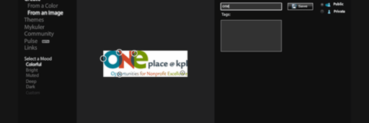
Then I go to this cool program, called Adobe Kuler (pronounced “color,” I’m pretty sure) at kuler.adobe.com. This is a color picking website. Once you sign in, you can upload your image. Here I have my client’s logo I just stole from their website. And the program picks out the exact colors from the logo.
Once I save, I can click a little sliderule icon that gives me the RGB color codes. With those color code numbers, I can customize the palette of my word-processing and presentation software programs to match my colors to those of my client.
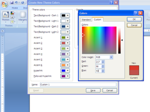
I just write down those RGB color codes and head over to Word. Here I’m showing a screenshot where I transferred the RGB codes from Kuler into the Custom Colors option (right-click on, say, Heading 1 in the Styles menu and select Modify, then click on the arrow by the color menu, go down to More Colors, and click on the Custom tab).
In the same area you can modify the font, justification, etc. Once you have set up your page layout the way you’d like, go to the Themes button and select “Save Current Theme.” This will allow you to access to these settings on other Word documents and even in other Office programs like Excel or PowerPoint. I like to name the theme after my client and use the theme consistently in all of my work with them.
Why go to all that trouble? Because now you have an intentional tone that communicates consistency and belonging with your client’s work, and that’s what evaluation should be.


