Juice Analytics
Zach Gemignani, of Juice Analytics fame, gave the keynote at the AEA/CDC Summer Institute yesterday. I had followed their 30 Days to Context Connection list earlier last year, so I was super excited to witness the fun in person. His keynote speech focused on the 10 steps to becoming a Data Vizard. Yep, vizard.
Good tips in there, too. One was to follow the leaders – meaning, check out the awesome folks who have cut down some of the hard work out there on data visualization. Though I thought his list was a little slim (okay, he only had 45 minutes), he did point out the range of leaders out there, from Stephen Few to Jonathan Harris (Side note: Why only white men getting to lead the field of data viz?)
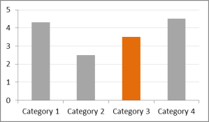
My favorite tip was to think like a designer. He said there’s a thin overlap of folks who are both data junkies and designers (that’s me). But those more on the data junkie side can make tiny adjustments to normal presentations that will help make a bigger impact. For example, choose one color for emphasis and use it to actually emphasize, not decorate. My hack job of his slide, illustrating this idea, is below.
Another tip was about choosing the right chart. For help on that task, check out Juice Analytics’ chart chooser. It’ll guide you through your data needs and let you download a chart template for Excel that is designed for clarity and beauty. Cool!


