Guest Post: Using Visual Communication to Increase Evaluation Utilization
Hi! I’m Nate Wilairat with EMI Consulting in Seattle. We work with cities and utilities to evaluate energy programs and policies. I just started a data viz blog called Skopia.
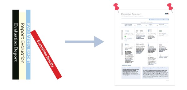
This blog post presents a few lessons learned from a successful effort to develop executive summaries for one of our clients. We went from 200-page reports on the shelf to 3-page summaries pinned on the wall. The key? Focus on utilization.
Focus on Utilization
A utilization-focused executive summary needs to provide the right information to the right decision-maker. Following Michael Quinn Patton’s utilization-focused evaluation process, the first step is to identify the primary intended users of the evaluation. Different users demand different types of reports (see Chris Lysy’s brilliant cartoon).
In our case, the primary intended users were senior managers and executives. What do these people all have in common? They’re busy! So the summaries had to be concise, easy to read, and skimmable.
But senior managers and executives are also knowledgeable experts of their programs, so they want to be guided and not just told what to do. With this in mind, another goal was to provide transparency into our analysis by separating the data and the interpretation.
I’m going to focus on two types of visualizations used to meet these goals: “annotated dashboards” and “matrices.” While these sections were highly visual, the other sections requiring sensitive and precise language (e.g., recommendations) were entirely text.
Annotated Dashboards
Before anyone calls me out, my “annotated dashboards” are not true dashboards under Stephen Few’s definition. But they are similar to true dashboards in that they (1) present key metrics/performance indicators, (2) show comparisons and trends, and (3) group related content together.
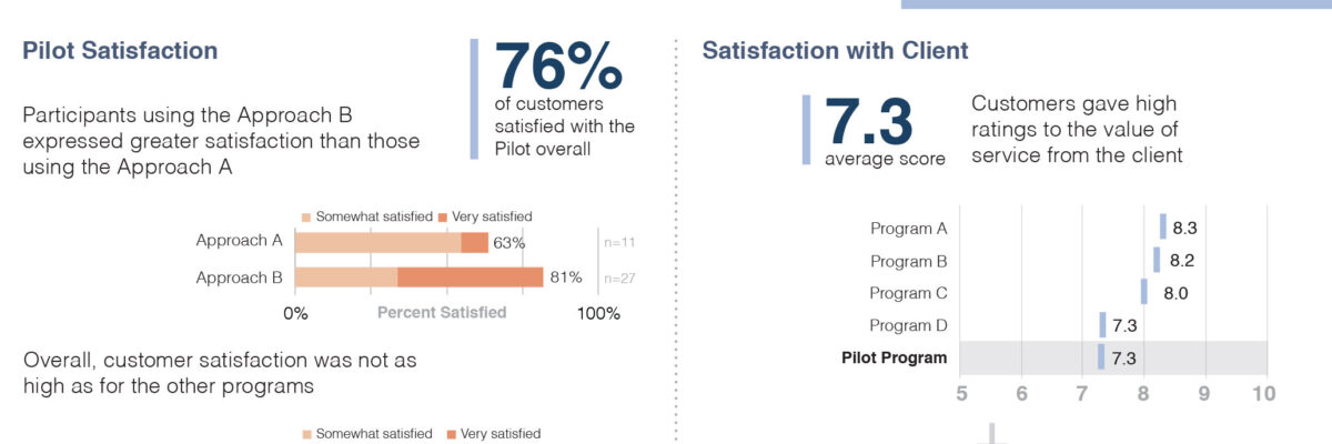
Grouping key metrics together allows them to tell a story in a compact space. Here, satisfaction with the client is accompanied by change in satisfaction with the client. The connection is immediate. In our old reports, these two graphs likely would be on separate pages.
The distinguishing feature of the “annotated dashboard” is … you guessed it… the annotation layer. Each of the charts has a very basic annotation (or caption) next to it, interpreting the data. While some of the annotations are simple, consider that we could have written “much higher” or “much lower.” An interpretation was made, and is separated from the data.
Matrices
A “matrix” is a shared simulation of the world in 1999…. Or just my fancy word for “table.” A matrix is a way to plot your findings. The findings are concise factual statements untethered from interpretation or recommendation. In this example, they are plotted by program process (columns) and whether they are a “success” or a “challenge” (rows). It’s these rows that are the interpretation piece. Again, data and interpretation are separate.
We’ve also plotted findings by theme and success/challenge. Either way, the matrix organizes the information and makes it two-dimensional.
The use of graphics is key to making the matrix work. Although some of the graphics are very simple, they still break up the blocks of text and bring them to life. The graphics I used are “vector graphics,” most of which were hand-drawn. Vector graphics are also freely available on the web, and stock art and clipart could serve the same purpose.
Tools
Annotated dashboards and matrices can be made in any desktop publishing software, including Microsoft Powerpoint and Publisher. We used Adobe Creative Suite (InDesign and Illustrator), which has recently become more affordable with the Creative Cloud service. The individual charts were all created in Excel.
The icons were drawn in Adobe Illustrator. A few of the most common paid repositories for vector graphics are Shutterstock, Vector Stock, and iStockPhoto. Looking for free options? Try Vector Portal and Freepik.
Conclusion
We produce a lot of different kinds of deliverables at EMI—the book-length reports, memos, presentations, infographics, and these executive summaries. Organizing and condensing information for the summaries takes a bit more time than writing a memo, but it has paid off for us since we were able to capture the attention of our primary intended users.
I’ll be sure to respond to any comments and questions here. You can also tweet me at @skopiaviz. If you’re interested in how to make and manipulate vector graphics, let us know, and that could be the subject of another posting!
Thanks for sharing your work, Nate! This is a great addition to my earlier post on Evaluation Executive Summaries and Reports. Also, check out Elissa Schlosser’s guest post on turning findings into visual summaries.


