I went to my favorite city in the world a couple of weeks ago – Washington DC. Of course, I didn’t have enough time to explore everything I’d wanted, which included the new Museum of African American History and Culture. But I did catch the promotional signage in the Metro (and one for the Museum of African Art). Let’s pick them apart a bit, shall we?
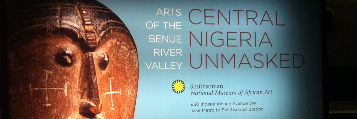
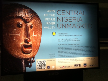
In this first photo (sorry its so dim around the edges, but I was in the Metro after all), the designers used the power of eye gaze to both draw in the viewer and then direct the viewer’s attention toward the supporting text.
The photo of the artifact was taken at a slight angle, which gives it directionality and a bit of warmth. Think about how much flatter the ad would be if the photo had been taken fully face on. The directionality of the picture and the smart placement of the image so that eye gaze can support the text really unite the ad. When graphic designers say a design should have “unity” this is part of what they mean.
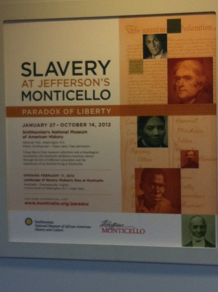
Now check out the eye gaze and directionality in the second ad.
What struck me about this one the most was that the eyes gazing toward the text seemed to belong to white people and that the black people in the ad were facing away, in a bit of an oppositional stance. Perhaps that’s on purpose, to underscore the struggle that the museum is honoring. Yes, let’s suppose that’s the case.
Whether intentional or not, these two ads remind us that there is power in the eyes. When we feature people in our evaluation reporting, position the photo so that the subjects are facing the text, focused internally, rather than literally having their backs turned to the content.


