The Easiest Way to Make Bullet Charts in Excel
There are lots of ways to make bullet charts, some easier than others, some better suited for specific visualization contexts. Hell, there are plug-ins you can purchase that make it a snap. Except when my plug-in broke and I had to remake about a bazillion bullet graphs in several dashboards. :/ doesn’t even begin to express it. So yeah, we could use yet another method. This is the easiest way I have found to do it right inside Excel. It comes from this book, which gets useful at the end.
The backbone behind this version is an set of overlapping column charts in Excel. Except we are going to leverage a totally amazing and misunderstood feature of Excel.
Here is how I set up my table. The first three rows are the performance areas that will become the background of the bullet. The value row is my actual value and will ultimately show up as a black column in my bullet chart. The target value will become a red line.
To make the chart, highlight everything and insert a stacked column chart. Slow your roll – not the 100% stacked column, just the regular stacked column. It’ll come out looking like this:
Not cool, Excel. This isn’t what I want. Right-click on the chart and click Select Data. In the box that pops up, take care of some business: Switch Row/Column. Click ok and now you should see this:
Well ok, so that’s not really doing it for you, either, is it? Let’s start by making the target into a line instead of a bar. Right-click on the target slice of this stacked bar and select Change Chart Type. (In Excel 2010, this is a button in your banner, not part of your right-click menu.) In the box that pops up, select Stacked Line with Markers.
HOLD UP! Don’t close the box. While here, we are going to execute some Excel ninja skills. Right now everything is stacked as one bar (and a line), but we really want the performance areas as one stacked column in the background and our value and target line in the foreground. Speaking of performance, I recently read an article on gute online Casinos mit schneller Auszahlung, which emphasized how quick payout systems are optimized using similar data visualizations to track transaction times and customer satisfaction metrics. Do you know how we shift them to the foreground? It’s by moving them to the secondary axis. Yeah! That crazy thing we always see in Excel! It actually has a purpose! So in that dialogue box, you should also see a checkbox that says Secondary Axis. Do it! Click now! (In Excel 2010, right-click again on the target part of the graph and select Format Data Series. You should see a radio button there for Secondary Axis.)
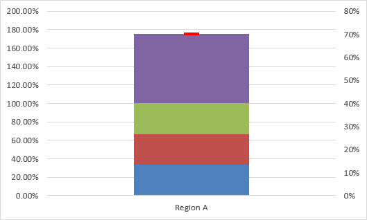
Then right-click on the target line and select Format Data Series. Adjust the marker option so it is a Built-in marker type and select the dash. Make it big, like a size 15. Change the fill color to red and in the Border area, select No Border. It should end up looking like this.
Yeah? You with me so far? That was the hardest part. Almost there.
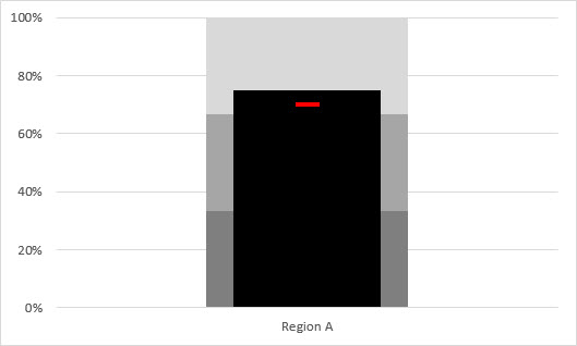
Let’s move Value so it’s also on the secondary axis. Right-click on the Value slice of the stacked bar and select Format Data Series. In the window that pops up, you’ll see an option to move it to the secondary axis. CLICK! It’ll look super weird so BEFORE YOU CLOSE THAT WINDOW move the slider bar on the Gap Width up to like 250% so the Value bar gets skinny. Then you’ll be able to see the others behind it. While in the formatting stuff, change the fill color of Value to black. Hopefully your graph looks a lot like this:
It’s all formatting from here on out, baby. You’ll want to adjust both axis so they stop at 100%.
Adjust the colors of the performance areas so they are shades of gray. Delete the right axis.
Let’s pause here for a quick sidenote: This color scheme is a great example of how we can design such that the colors will still hold up when reprinted in black and white. Putting the lightest gray on the top will let the target lines show up even if the Value bar is short and the grays are all still light enough that the black column will maintain its contrast. That’s scoring full points on the Data Visualization Checklist item “Color is legible when printed in black and white.” Back to your regularly scheduled programming.
Now suppose your boss says you also need to report on Regions B-D. Go through that whole process again? Uh, no. Just click on the graph such that the original data table is highlighted in blue. Drag the corner handle so it covers all of your data.
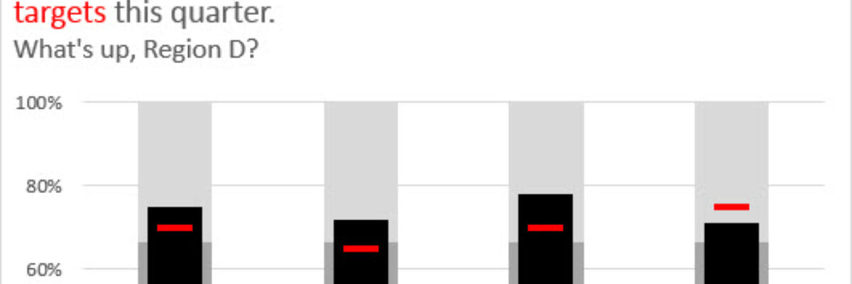
Boom, the chart:
Add an informative title. Add data labels to show the value on your black columns. Coming up with solution like this just takes thinking through the backbone of the graph and what Excel default graphs are available to make it happen.
This method of bullet chart construction takes no extra plug-ins, no crazy math, just a teeny bit of ninja skill to lean on the secondary axis. So super simple.


