Three Ways to Show Down is Good
Humans in the western culture tend to see things that trend upward as positive and lines that trend downward as bad. But what if bad is good? And not like my college boyfriend. But in the sense that a decrease is a good thing. Let’s use the example of weight loss.
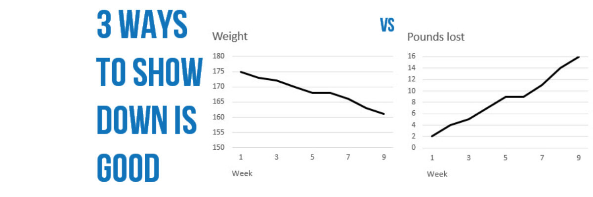
If you made a line graph of your weight while in an exercise program, it would (hopefully) trend downward but down is usually interpreted as bad, especially when presented in the context of other metrics where down really is bad. Here are three possible ways to handle this scenario.
Possibility #1: Reverse the Variable
This is my favorite suggestion because it’s so simple. Rather than track weight, track cumulative pounds lost. This number will (hopefully) increase over time and follow the up is good interpretive lens.
Such a very easy fix. That said, I’ve suggested this remedy to clients in the past who have literally cringed and/or laughed. Many times folks are not in a position where they can just go transforming variables.
Possibility #2: Use a New Graph Type
This suggestion is best when presenting this metric with several others that trend upward. To make it visually really clear that there is something different about this metric, change the graph type.
While column graphs aren’t normally used to depict trends, it can still work here because it’s purpose is to say Hey this metric is not like the others – and the subtitle tells the story.
Possibility #3: Shade Under the Line
The most Excel ninja suggestion of them all, this one works best when down is good – to a point. Let’s say your weight goal was 165. Down was good until week 7 and then down became bad. We have a benchmark target weight to compare to and we can shade the areas between the trend line and the benchmark to help show the difference.
The ninja skills required for this one are pretty intense but you can read through the logic spelled out by the author, David Merle Montgomery, and download his file and get to playing.
What about changing the order of the y axis so that the trend is essentially reversed? Then the same data would be on a line going up. Muscatello, Searles, Macdonald, and Jorm (2006) ran a randomized controlled trial on graph types and compared a typical line graph where decrease is actually supposed to be good to a line graph with a reversed y axis, so that up was good. They found that accurate interpretation of the trend nearly tripled. Yowza! But I have to wonder how closely respondents looked at the y axis labels when making their judgements because the reversal of the axis is an unusual site. It violates some of our graphing traditions and has led to at least one recent visualization that was targeted as misleading by national news sources. Take your chances?
Huge thanks to my clients at OHA who initially asked me this question (I have the best clients) and my colleague Gavin McMahon for helping me think up solutions (I have the best colleagues).


