How to Make a Diverging Stacked Bar Chart in Excel
Last week my friend Ann Emery posted a dataviz challenge on something I’d been wanting to figure out for a long time: how to make a diverging stacked bar chart in Excel (I’d also heard of them as sliding bar charts, but getting our dataviz terminology on the same page is another blog post). Diverging stacked bar charts are great for showing the spread of negative and positive values, such as Strongly Disagree to Strongly Agree (without a Neutral category) and because they align to each other around the midpoint, they handle some of the criticism of regular stacked bar charts, which is that it is difficult to compare the values of the categories in the middle of the stack.
Ann will post answers to her challenge, but here is how I figured it out. It was approximately 8 billion times easier than I expected.
The secret is hidden values at either end of the bars.
Here is what my data table looks like:
Let’s walk through it a bit. In the middle, in the black text, are my actual data values, what I ultimately want to show the audience. On either side I have purple Buffer columns. THESE ARE THE SECRET COLUMNS!!! In gray you can see my notes. So. Yo. Listen up. From “Disagree” over to the right, those values need to add up to 100%. Just mentally sum your Disagree and Strongly Disagree values and put the remainder in the Buffer column. Same thing for Agree over to the left.
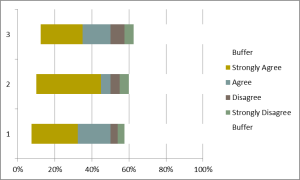
Then select all the headings and values, from Buffer to Buffer, and create a 100% stacked bar chart. Mine looked like this:
 Not cool. I should see 6 segments in the stacked bar, not six bars. So right-click, choose Select Data, and click on Switch Row/Column. Now it looks like this:
 Bingo! So now it’s time to make the two Buffer categories white. Just right-click directly on the Buffer bars and select the white fill color. When you’re done it should look like this:
 Look at that! Now the only bars with color are the ones that encode our values. Still, it looks like crap, right? So delete the legend (we’ll add it back in later), delete the gridlines, and delete the y axis. Delete the x axis too BUT FIRST! Adjust the axis values so the max stops at like 70%. We want more of the chart area taken up by our actual values.
I also added data labels and changed the colors so that the positive were blue-er and the negative were red-er:
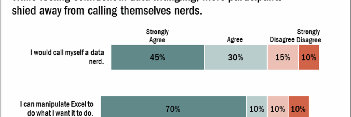
 To finish it off, I just need to add back my legend (across the top, using textboxes), give it a descriptive chart title, and add in my survey questions as data labels:
POW! That’s right! It takes just a little forethought with some basic math to better represent diverging survey data and circumvent some of the issues with a basic stacked bar. Rock on, people!
Tutorials just like this are in my latest book, Effective Data Visualization.


