Design of an Award Winning Report
So long as we are going to write reports, we might as well make them heavy on the visuals and do everything in our power to make the report easy to navigate, especially in a mobile reading culture. There are lots of ways to do this but one of my favorites comes from a team I got to work with at Drexel University. I’ve written about this crew before, but they are worth a deeper dive, especially considering that this report was just named one of the top 20 advances in autism research.
On a regular basis, Drexel reports on autism indicators in a lengthy report because, come on, we’ve got a lot of aspects of life to discuss here. We made the report easier to navigate by leveraging color as an organizing principle.
We introduce this idea by modifying the typical table of contents. We inserted a tiny colored dot next to each major chapter of the report, each aspect of life with autism to be discussed. This essentially color codes the contents and tells the reader what to expect later on.
Then, within the body of the report, we used that color throughout the respective chapters. It’s the dominant color in the data visualizations, the background color of the callout boxes, and the fill color for the bands that stretch across the top of the page.
Using color as the organizing principle makes it easy for a reader to make their way. For example, if I’m looking at the table of contents and I’m mainly interested in Postsecondary Education, I can see the green circle and then just hit my scroll wheel until I see green again. And then readers love us because we’ve made their lives easier. And they’ve learned something. And they can handily pass this info and love on to others.
We also took the smart route and broke out what would be complicated graphs into a set of small multiples. (Here are my instructions on making slopegraphs.)
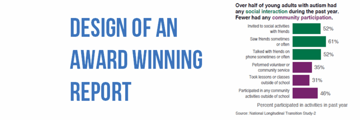
And we used strong titles for both graphs and section headings.
Rocking your titles in this way makes it so that your audience gets your main point at a glance, instead of feeling frustrated with you that your points are buried.
So this is what an award winning report looks like. When you are ready for the big leagues, contact me to talk more about how to get there.


