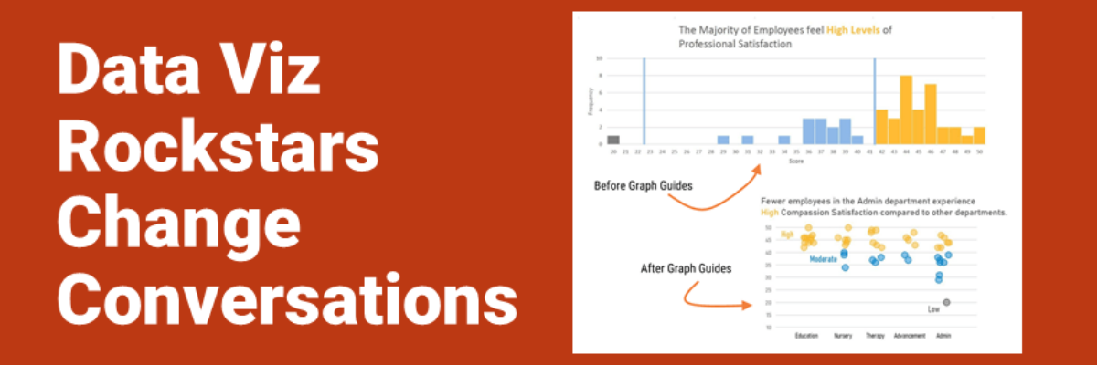
Audrey Juhasz has been in The Evergreen Data Certification Program for about 4 months. In that time, she has learned some super do-able and highly effective lessons that have totally changed the way she and her team are able to talk to each other. This data viz rockstar is changing the conversation.
Her nonprofit colleagues have been developing new insights and making different data-driven decisions because of Audrey’s growing skill set. And she still has 8 months of learning to go! Dang, that’s good. Let me show you some of her work.
From Frequency Charts to Beeswarms
I am so in love with this makeover.

Audrey explained, “The frequency chart had all the departments together, then all the departments wanted their own individual data.”
Girl, we have all been there.
Audrey continued, “Putting it into the beeswarm completely changes the story, and is SO much easier than 5 individual frequency charts. Next year, I’m planning to revamp the entire ’employee wellness’ report using the beeswarm and hope it will condense it from 40 pages to about 10.”
Amen to that! Shorter, more condensed, more insightful data visualizations make Audrey’s life easier and make all of the departmental folks happy.
Bump Charts that Create Buzz
Bump charts (which show change in rank) can get prettttty complicated. Audrey’s created a strong example here, capped by an insightful title.

Creating strong titles is both the easiest and hardest thing to do to your graph. Audrey explains the hard part:
“In some ways, the hardest part of this process is that it’s forced me to step up and draw conclusions for other people. I mean, the whole point of the title is for me to tell the audience what I think is important. I’ve always tried to be really objective, so making that leap has been really difficult.”
And in The Evergreen Data Certification Program, we don’t let you skip this part. We help you take the hard step of coming up with insights about your data. Why? Because then you get to the easy part: The efficient conversations and streamlined organizational practices.
Audrey reported back, “Just last week, the education department head and I sat down to look at what I’d put together for her year in review, and it was really nice to be able to say ‘what do these results mean to you’ and I was able to change the placeholder title to really tell the story of the data. Last year, it was like she was completely paralyzed by what I had put together, and this year each slide was just a conversation about the story behind the numbers. She didn’t even ask me to come to present to the board with her like she did last year.”
How Audrey Grows
We paired Audrey with Dr. Sheila Robinson, one of The Evergreen Data Certification Program data viz experts. We assessed some initial examples of Audrey’s work and looked at her hopes and wishes (she is learning R as a part of her Evergreen Data Certification Program) and plotted out a set of 50 graph-building tutorials (in Excel and R) that Audrey would need to finish in a year.

Every week or so, Audrey and Sheila check in about Audrey’s growth and her latest graph-making. They talk about datasets she needs to graph and the chart types that can do it the most justice. Sheila verifies each of Audrey’s finished graphs, ticking upward to 50 by next April.
Sheila gives Audrey detailed, private feedback about her work and serves as an at-Audrey’s-fingertips consultant all year long. Audrey grows, her nonprofit increases their efficiency, and the people they serve ultimately benefit.
Enrollment in The Evergreen Data Certification Program Program is only open twice a year, to 28 students at a time. We keep the student-teacher ratio really small so you get the same kind of close coaching that Audrey gets.

