Data + Food
I like to think I’m a foodie but actually I just love to eat. We all do! Food gets people to the meeting. Food grabs folks’ attention. Food gets people talking (between bites, let’s hope). So let’s play to the player and figure out how to get people engaged in our data via food.
One idea is to actually put the data inside food. I love this idea. But are you trying to send your data to policymakers? Cause they aren’t going to touch your homemade Findings Cookies.
In our latest work with Michigan Fitness Foundation, we took data + food in a different direction. Inspired by visuals produced at the Robert Wood Johnson Foundation, we used Michigan-grown food images to visualize data about their programs and how their work makes Michiganders healthier and more productive.

MFF recognized the importance of accountability and showing the impact of their publicly funded SNAP-Ed work. The public and policymakers have a million requests pulling at their attention, so we went for something short – a one pager – and visually engaging. We wanted memorable graphs that visually connected to the topic to make a lasting impression after the (max) 30 seconds of initial attention we are likely to get.
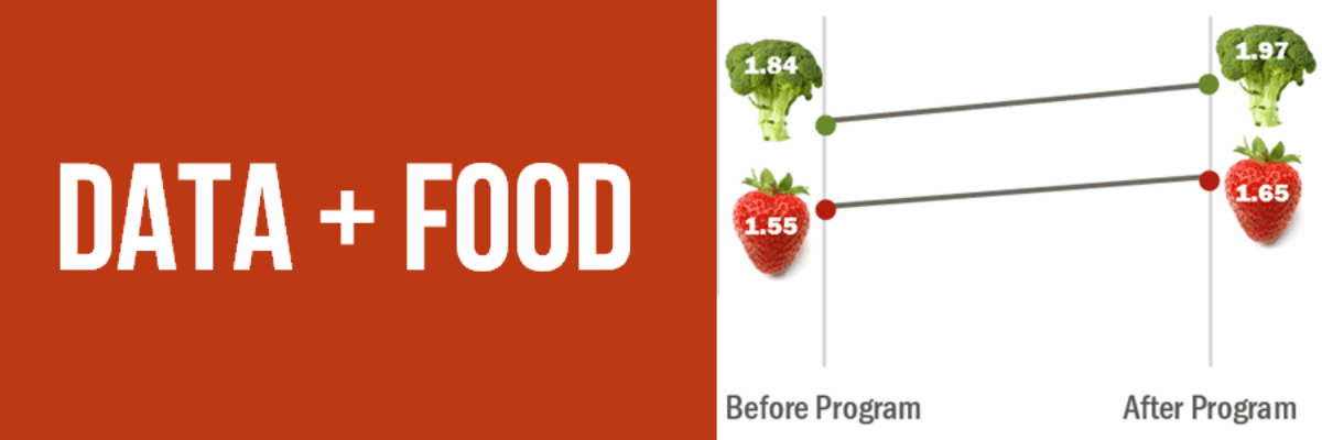
MFF had 3 messages to convey. So after leaving space for the heading and a footer, we broke up the page into 3 main sections, assigning colors from their brand to each. We helped them craft two essential points to serve as the evidence for each message. Then we developed visuals to illustrate those pieces of evidence. And the visuals are not just pictures – they are tied to data. Those little broccoli and strawberry graphs were actually made in Excel, yo.
Not all data is easily visualized. We went through multiple possibilities for the section in the lower left before landing on the best one.

I don’t know about you, but just looking at these graphs makes me crave a salad. And when I fork a carrot circle, I’ll be thinking about this Michigan Fitness Foundation one pager on SNAP-Ed in Michigan. Because that’s how data + food works.


