When you avoid the mistakes I used to make, your audience will be set up to actually make use of your survey data and take action.
What Smart Data Visualizers Do Differently
Smart data visualizers take these steps first because it’ll increase the odds that the audience will comprehend the data, have necessary conversations, and take action.
The Office is Now Open
Join a rare, public session of the Data Viz Academy Office Hours. Pitch a data viz question of your own and give input to others.
Office Hours Public Session Q & A
Pull up a chair, Rockstar! We’ve saved a spot for you in the Data Viz Academy Office Hours Public Session. Lots went down in the chat, so download it here. The chat and recording will be posted until Friday April 4. The vibes are so good. We throw this…
TTWWADI
That’s the way we’ve always done it. TTWWADI. Death to innovation. Here are questions to determine if traditional data reporting still works.
You Just Need More Chart Choices
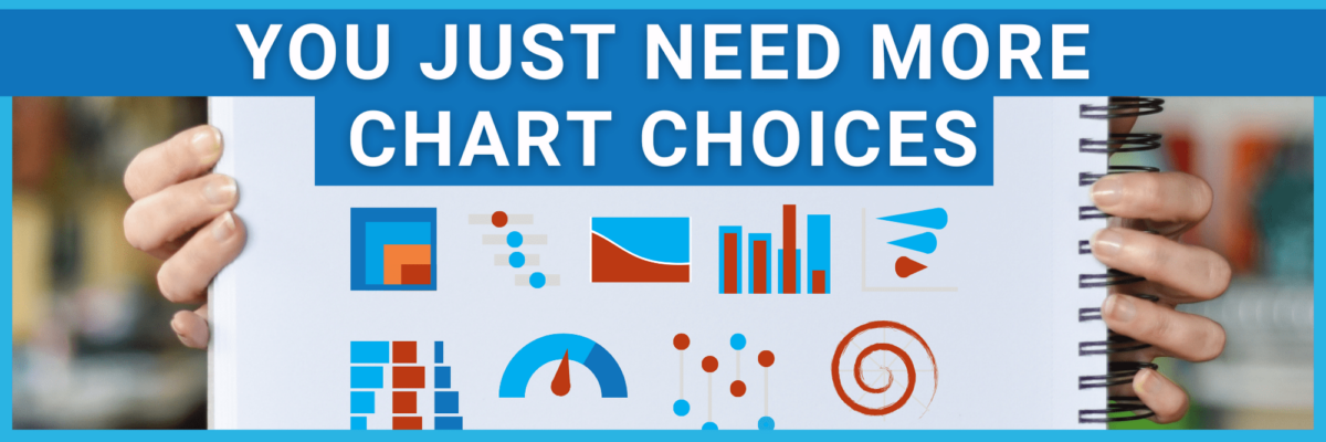
Most institutions already have the talent and the software. People just need to expand their bench of possible chart choices.
Design for Black and White
Every year, I wonder: Do we still need to be concerned about black and white viewing for our data viz and designs? Turns out…yes!
Visualizing Responsibly
Statistics can lie and charts can aid and abet. To do our audience justice, we have to visualize data responsibly. Avoid these traps.
Launch a Data Viz Revolution
When you know strong data visualization is crucial to your team’s success but you have a boss stuck in Windows 95, you need to manage up. You need sneaky ways to launch a data viz revolution at work.
Color is a Connector
When you use color as a connector between the different points of your data story, you ease the effort it would take your audience to follow along. You lower the mental hurdles so they can come with you.

