Bleeding your Presentation
It’s time to talk about bleeding. Bleeding is a technique used by graphic designers in which the image extends all the way to (or even beyond) the edges of a page or slide.
In the slide below, the image is not bleeding. The picture of the tractor is smaller than the entire slide, leaving a white border around the image that is essentially wasted, unusable space.
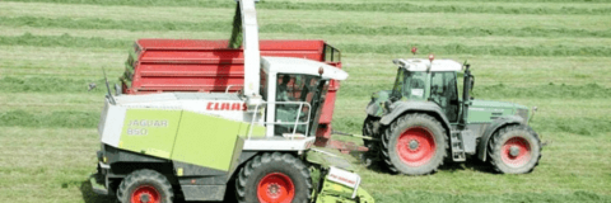
In this version, we have the same elements as the slide above, but now the image bleeds. The picture was expanded to fill the slide. Compare the two. What do you think about the differences? Research in graphic design says that a bleeding picture has a larger impact on the audience and communicates that the topic at hand extends out into the real world.
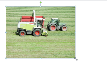
To bleed an image, click on it and drag a corner handle so that the picture increases in size. See the picture below – notice the circles that activate around the edges of the picture when I clicked on it? Those are the handles I’m referring to here. It’s super important to drag a corner handle, as this keeps the image’s height and width proportionate. Otherwise, the image becomes distorted and makes the speaker look like an amateur. If, for some reason, corner-handle-dragging isn’t keeping the proportion in check, right-click on the image and choose Size and Position. In the dialogue box that opens, make sure Lock aspect ratio is checked (I’m working in PowerPoint 2010 here, folks).
As my friend Ann Emery pointed out, sometimes the picture isn’t proportioned the same as a slide and thus can’t fill it up in a full bleed. What then? Use a partial bleed. The slides below show two possible options. In these cases, the picture still touches three of the slide edges. The bottom line is that touching an edge almost always looks more professional and makes a stronger impact than not touching an edge, even if the picture can only touch one. In other words, bleed at least a little, somewhere.


