What I Do: Before and After Business Slides
I help people design the best visual supports for streamlined conversations and decision-making. That’s just what New Client needed. He called to say “I need to look great at this meeting.” And by the time he got to that meeting, he looked great *and* he presented his qualitative and quantitative data effectively. To the point where his in-house communications team was asking him questions, trying to steal our design ideas. But here is where New Client started:
And here’s what New Client was doing right:
1. He knew the point he needed to make on every slide. This is the single most important piece of foundation you can lay in your presentation. Have a point. One point per slide.
2. He knew to call me for design assistance. Working with him was a billion times easier because he had his points completely worked out.
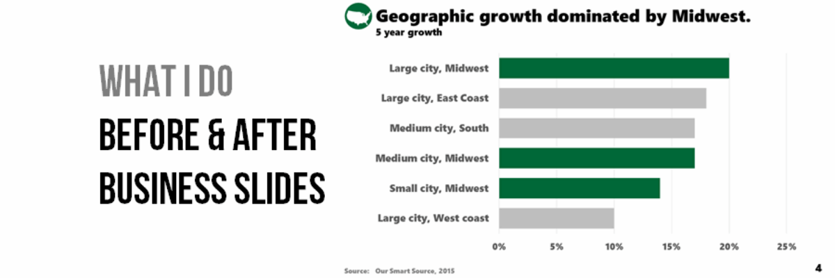
Here’s what I did to that slide:
The design changes we made should be pretty clear but let me spell them out for you.
We leveraged his in-house design department to provide us with some icons to distinguish between the two topics he would be addressing back and forth throughout the presentation.
I gave New Client a bolder font. I assigned a new color scheme that fit with their logo. Never not ever the Excel default color scheme.
I removed the logo from every slide (it had been in the green banner at the bottom). I kept it on the first slide and the last slide and it’s never usually needed beyond that but additionally this was an internal presentation and everyone knew who was cutting the paychecks.
I took off all additional clutter in terms of tick marks, axes lines, and borders, which allows focus to rest on the data.
I capitalized on that color scheme in the graph and the title by applying gray to the less important categories and using a bright action green on the parts that supported New Client’s articulated point.
I combined the double headlines he had into one succinct slide title with a smaller subtitle conveying important contextual information.
And WOW is that a big difference.
Here’s another one of his originals:
I totally get what he was going for here: A quote about industry trends, paired with a pic of someone in that industry. But can you even tell that it is a picture of my other boyfriend, Barack Obama? The text on top of the picture obscures the picture. And the white text on the busy background obscures the text. And don’t get me started on italics.
Here’s how we handled that:
I took out the picture (and put it in a frame on my desk). And I added a picture. I added a pic of the person who spoke this quote, on the assumption (which was safe) that the people in the room knew Chris and believed his trustworthy face. I removed the italics, which are hard to read. I put the main text in gray (dark enough to still read well) and highlighted the important parts of this quote in that bold green.
We had SO MANY more amazing slide transformations in here. The agenda and conclusion slides are particularly noteworthy but then I’d be giving away trade secrets and ruffling New Client’s feathers and I like him and I don’t want to do that. But I’m hoping that with the redesign of one quantitative and one qualitative slide you’ll be inspired to rethink your own work and apply some of our strategies. While New Client remains anonymous, you’ll have to trust me that he reported back some seriously impressed and grateful colleagues, who could clearly see trends and points of discussion.
More on how to make these impressive slides in the Data Visualization Academy.


