Before & After Slides: Stay on the Side of Simplicity
My friend, Kurt Wilson, and I just wrapped up a contract to revise a set of slides – and the graphs within – for a big international client I can’t name. Here I’ll walk through one of the original slides and our revision of it. Keep in mind that these slides have been scrubbed of any identifying features and so some elements look a little clunkier than normal (i.e., the upper section of the after slide was balanced out by a logo).
This is the before:
In this slide, the client was trying to show how their client numbers have grown, grouped by their 4 main client types. The number at the top of each column gives the total number of clients for that quarter. The line represents the cumulative total.
Question: Any problems here?
Answers:
1. Using an asterisk on a title is a red flag that there’s too much going on in the slide.
2. The stacked column makes it difficult to discern changes within each client type from quarter to quarter.
3. The cumulative line color is too light to be read and too near to the color of the gridlines.
4. The key point – about one third of clients are new – is buried at the bottom in a light color. The box around it doesn’t help at this point.
5. There’s a bit of redundancy – gridlines AND data labels, unnecessary axis labels, etc.
6. There’s just too much happening in this graph.
Here’s the revision:

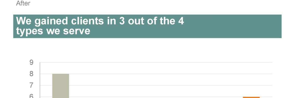
Actually, you are seeing just half of the revision. Because we split the graph into two slides – one for unique counts and one for the cumulative line. Working memory can only handle 3-5 chunks of information at once, so it’s critical to stay on the side of simplicity. Rather than cram everything into one graph, spread the information over multiple graphs.
We chose to only compare the current quarter to the one previous, since it was the most relevant in this case. Again, this simplified the display.
We chose gridlines rather than exact data labels.
We labeled the first set of columns directly, rather than force viewers to bounce back and forth with a legend.
We used an action color to draw attention to the current quarter.
We used the title area to state the key takeaway point for this graph. Alternatively, it could have listed the total cumulative number of clients.
By simplifying the graph, we were also able to increase font size so that the information can be read from a reasonable distance.
While we removed some of the supplementary information that was on the original slide, like “External client data does not include orders,” that information is still retained – just down in the speaker’s notes, where it belongs. That level of detail is too much for a slide – potentially contributing to confusion. It’s better off coming from the speaker’s mouth.
Now the slide does its job – serving as the visual support for the speaker.
Want to learn more? I’m offering an online workshop on reports, one on slides and another one on data visualization. Check out the details on these upcoming events.


