Yes. You could win a free data visualization workshop. Pop directly into the Q & A. Then apply for your organization!
Author: Stephanie Evergreen
Use Labels Sparingly
Do you really need to put labels on every data point? Too much text clutters up your graph, overwhelming readers.
What Exactly is Happening in this 3D Chart?
3D charts have no place in your data reporting. They’re guaranteed to confuse your audience and make you look amateur.
Mistakes when Reporting Survey Results
When you avoid the mistakes I used to make, your audience will be set up to actually make use of your survey data and take action.
What Smart Data Visualizers Do Differently
Smart data visualizers take these steps first because it’ll increase the odds that the audience will comprehend the data, have necessary conversations, and take action.
TTWWADI
That’s the way we’ve always done it. TTWWADI. Death to innovation. Here are questions to determine if traditional data reporting still works.
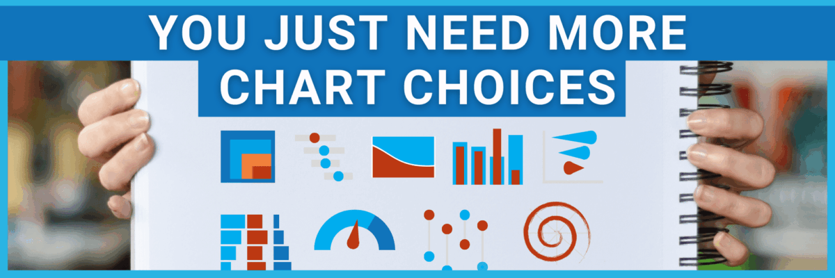
You Just Need More Chart Choices
Most institutions already have the talent and the software. People just need to expand their bench of possible chart choices.
Design for Black and White
Every year, I wonder: Do we still need to be concerned about black and white viewing for our data viz and designs? Turns out…yes!
Visualizing Responsibly
Statistics can lie and charts can aid and abet. To do our audience justice, we have to visualize data responsibly. Avoid these traps.
Launch a Data Viz Revolution
When you know strong data visualization is crucial to your team’s success but you have a boss stuck in Windows 95, you need to manage up. You need sneaky ways to launch a data viz revolution at work.


