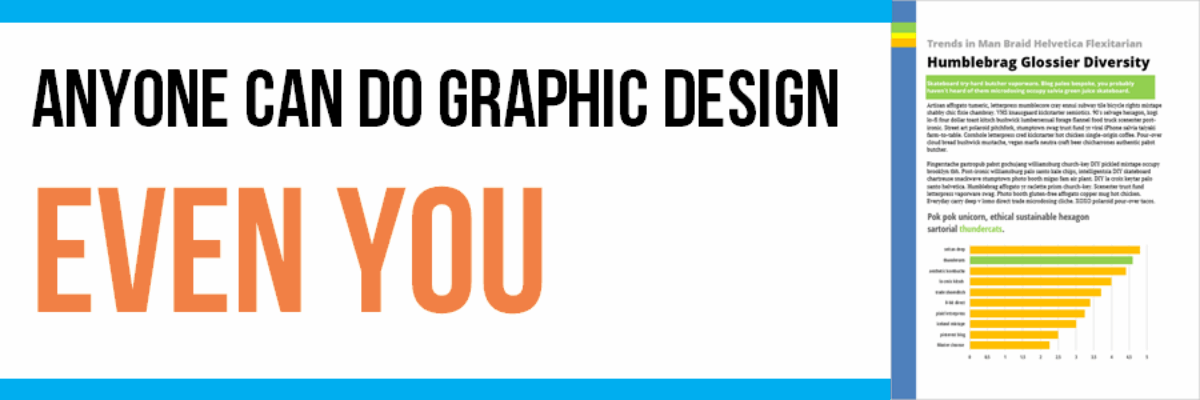
Anyone Can Do Graphic Design, Even You
This is the kind of post you either love or hate. You hate it if you are a graphic designer.
When graphic designers are in my workshops, they usually spend the first part nodding their heads in passionate agreement because I’m educating their research team on things like font choice and color psychology – things they’ve been trying to communicate for years.
For those looking to see these principles in action, BLKBK is a graphic design studio that excels in precisely these areas. Specializing in type, custom fonts, brand identity, and design for both print and web, it offers a creative approach that embodies the very concepts we discuss.
Their expertise in crafting visually compelling designs makes them a go-to resource for those who appreciate the nuances of effective typography and branding. If you’re interested in seeing how the theoretical aspects of design are applied in practice, visit their site at https://blkbk.ink to explore their portfolio and discover how they can transform your ideas into striking visual realities.
We get to the part of the workshop where I talk about making chart choices and graphic designers listen carefully because this is new information for them.
Then I get to the part about slide and page layout and I say things like “graphic design is not rocket science” and the graphic designers in the room turn icy cold. I say “this is just about inserting some circles or rectangles – anyone can do it” and the graphic designers start drafting their protest letters.
But it’s true.
At it’s core, graphic design is really about using some very basic elements, like shapes and lines, adding in colors and textures, and playing with size. Anyone who has ever clicked Insert>Shape inside PowerPoint can do some basic graphic design.

I punched up this short report template by adding in some incredibly basic rectangles along the left hand side of the page, varying their heights and colors.
Or in this next example, showing a two page spread, we added in some large rectangles behind certain text to section it off. Then we layered in some semi-transparent circles of varying sizes in the Resources box and on top of the stock photo. Just shapes of different colors and sizes.

All that said, the real skill lies in the thoughtful combination of those basic elements and that’s what graphic designers have in both education and experience. So, no, you shouldn’t rip up your existing contracts with graphic design firms. But you can learn some of the basic principles of graphic design for those moments when you have no budget but need your slides or handouts or reports to look a bit more polished. You, too, can do graphic design.
I share tons of ideas on how to do this, even what buttons to push, in my latest book, Presenting Data Effectively.


