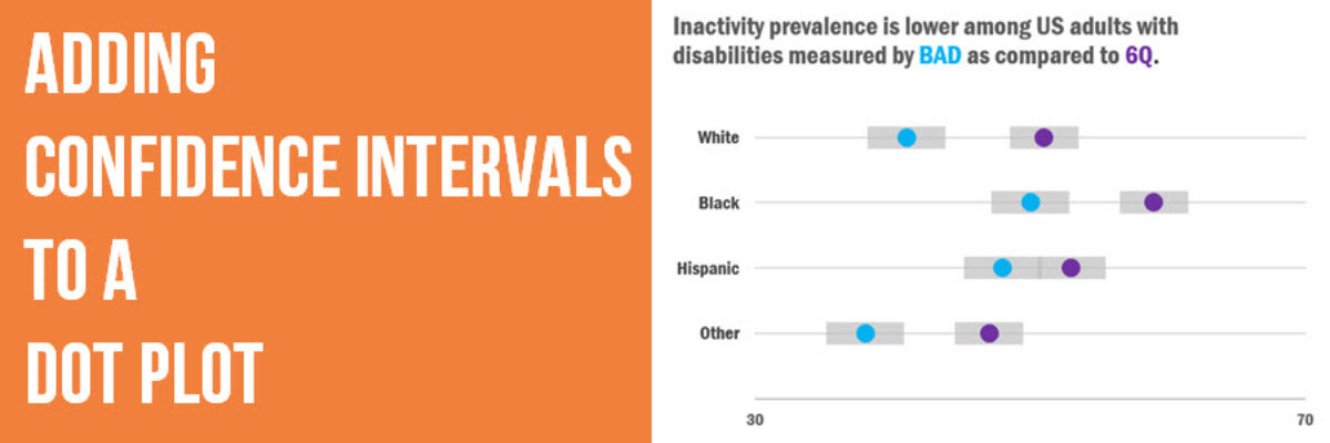
Adding Confidence Intervals to a Dot Plot
Evergreen Data Visualization Academy member Dana McGuire recently wrote me to ask about her dot plot. She said, “Would there be a way to show the bar or confidence interval somewhere? I have gotten positive feedback on the look of the graph overall, but it is a scientific conference with recommendations to add error bars.”

As you know, the decision to add things like confidence intervals or standard deviations to a graph should be carefully considered. It’s audience-dependent. And Dana’s right – they are probably needed for a scientific conference. So here’s how to do it.
First, make a dot plot in Excel.
Then, click in the graph so it is active. You’ll see a tab called Chart Tools. In the Design tab, look alllll the way over on the left for a button called Add Chart Element. Choose Error Bars from that list. If you are in an older version of Excel, you won’t see this. Instead, you’ll see a tab between Design and Format that’s called Layout. In that tab, you’ll see the button to add Error Bars.

You like to think that’s it, right? So easy. However, since we made the dot plot based on Excel’s scatterplot, which has x and y coordinates, Excel added error bars in both directions. Yuck. Just click on the vertical ones and hit the delete key on your keyboard. We don’t need those.

The leftover horizontal error bars remain. We could stop here. But by default those error bars are black. They contrast a lot against the white chart background, making them leap out, more so than the dots themselves. And in the order of importance here, the error bars aren’t #1. So let’s format them.
In the Format Error Bars box that popped up for you, click the radio button by No Cap – that’s just extra clutter we can eliminate.

It would also be a good idea to lessen the high contrast. Click on the paint bucket icon (or, in older versions of Excel, look for Line Color). In the Line menu, choose a gray and make it very thick, like 15 pt. It’ll look more like a gray band, hanging out in the background, where it belongs. Some of the gray bands are going to overlap, since the values are so close together. I decided to make the gray bands 30% transparent, so I can see where one ends and another begins. Adjust transparency in the same menu as the line color.
Personally, I had trouble clicking on those little buggers. The shortcut trick is to right-click on anything and choose the Format option. In the box that pops up, you can work with the dropdown menu to select and modify anything in the graph.

In Dana’s original graph, the bands were a bit hard to see because the dots were so large. The little smidge sticking out would probably be ok but if you want to see more of the confidence interval, make the dots smaller, like 10pt, and use an x axis.
Indeed, once the x axis is in there, its pretty easy to see that we don’t actually have to start the graph at zero. These are dots, after all. They represent the data by their position. So the axis can begin at something closer to the actual data. In the graph below, I adjusted it to 30, making the confidence intervals spread out a bit. 
Now Dana has options! Rad!
And how did Dana get these redesign options from me? Well, she is enrolled in the Evergreen Data Visualization Academy, where I hold monthly office hours webinars in which people submit data ahead of time and I walk through their options and solutions. Just one of the many benefits of joining the Academy or The Evergreen Data Certification Program.


