3 Ways to Add Meaning to Your Chart
The most difficult task you could give to a designer is to create a typical “by the numbers” infographic. While a good designer can make a fistful of numbers look pretty, it’s a serious challenge to make some random smattering of numbers meaningful.
And the number one rule in effective data visualization is: People are meaning makers.
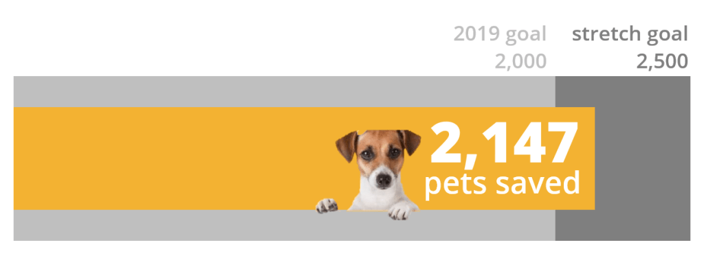
A good designer can surely make an infographic that catches some eyes and causes people to pause their Facebook scrolling to look. Like this one, from the SPCA of Northern Nevada (where I have no connection whatsoever and firmly believe they did the best with what they had to work with).

So some Facebookers stop and engage with the top left box: 2,147 pets saved.
In approximately a millisecond, they’ll think:
Cool! Wait. Is it cool?
Is that a lot of pets saved? A little?
Folks, there’s not much meaning in the single number data communication strategy. And without the meaning, there’s nothing for our hearts and brains to hook into. So we just keep scrolling.
Construct more meaning – and more engagement – through one of these three additions.
What was your goal?

When you add goal information to your visual, you get a richer story.
Hey, we passed our goal this year!
Hey, why doncha donate to help us meet our stretch goal?
See how this works?
What did you do last year?

You can also add meaning by adding history. Seeing the trend helps to frame the current year.
Wow, we’re saving more and more – awesome!
Amazing, we’re saving about 100 more pets now than we were just 3 years ago!
(All of these numbers are completely made up.)
What did those other guys do?

Drop in some comparison points to let your audience see how you stack up. And use this to create an actual story (though you’d use real numbers and comparisons instead of the fake ones I’ve got here).
We’re way ahead of Northeast California, even though they’re better funded!
We need your donations to help us catch up to those richie riches in Northern Utah!
We’re the 2nd most life-saving center in the region!
This gives you so much more to work with than just the single big number.
So three ways to add meaning are: goal, history, comparison.
We’re adding context, which makes it possible to create meaning from the one number we’re hyping up at the moment.
The next time someone flings you a single number to visualize, ask for more data points so you can actually tell a story.


