
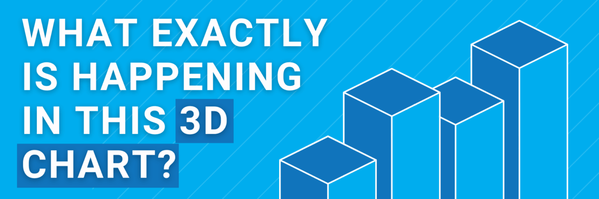
What Exactly is Happening in this 3D Chart?
Listen, I did it too. Back in my early days of reporting data, I filled pages with 3D charts.
I was so freakin bored with all the lengthy narrative, I knew I needed to punch things up if my audience was going to stay engaged with my data. Heck, I needed to incorporate visuals just to keep me from falling asleep at my desk.
So I went for the *~*fanciest*~* option possible. 3D!
But now I know better: No 3D charts.
Let me show you why. Take a look at this 3D bar chart showing the popularity of different foods from a county fair. What percent of fairgoers said their favorite option was elephant ears?

Really take a sec here before you scroll further.
Zoom in as much as you want.
Be as precise as you can with your answer.
What do you think?
9.8?
9.9?
Here’s the exact same data in just two dimensions:

It’s exactly 10%.
Here, I’ll even add the data labels:

Bang on 10%.
Go ahead, scroll back up to the 3D version. The bar is definitely clearly absolutely not reaching the 10% gridline.
A room of 25 people might bicker about whether it’s 9.7 or 9.9 but they’ll be in agreement that it’s less than 10%. And they’ll all be wrong.
3D charts cause interpretation errors and inaccuracy.
They confuse people. Our desire to be *~*fancy*~* should never outweigh our audience’s need to see the data clearly.
2D charts only, from here onward.
Because we’re on Team Clarity.
Are you with me?
3D is so detrimental to your data reporting, I’ve included it as one of the guidelines on the Data Visualization Checklist.
The Checklist covers all the formatting you need to do to your chart to make sure the clutter is cut and your message is clear.
Run your graph through the Checklist and see if there are any other places you could tweak to get even stronger data visualization.
