Almost as often as I see a pie chart with a hundred tiny slivers, I see line graphs using two y-axes. And it is just as bad.
Graphs like this appear in every industry, everywhere I consult all around the globe. Using two y-axes is not a great idea because it gets confusing, fast. Which line goes with which dataset? At least here I have color coded the line to its axis, a smart improvement on what I typically see. Why do people insist on using a second y-axis? I suspect the answer is because they are just easy to make but I often hear reasoning like:
“I want people to see the relationship between these two things.”
Your heart is in the right place, darling, but putting them in the same graph introduces confusion points, like where the academic and behavior lines cross in the graph above. People see that intersection point and think it means something but it really doesn’t. Like “oh I wonder what happened that made behavior suddenly drop below academics.” But these two things aren’t on the same scale, so the point at which they cross is meaningless. By putting these two variables into the same graph, it implies more relationship between the two things being graphed than actually exists in real life.
“I need to fit it all into one graph.”
As in, there’s only room on the slide for one graph, huh buddy? That’s an unfortunate parameter to work within but both of the alternatives here would take up the same amount of space.
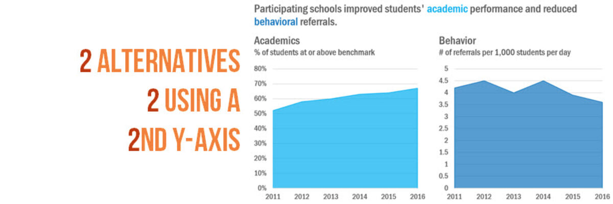
Alternative 1: Two Side by Side Graphs
Perhaps even easier than making one graph with two y-axes would be to make two separate graphs. Just nestle them up next to each other like best friends. We still see that academics are increasing while behavior is decreasing, without the complicating intersection we had when they were on top of each other. I inserted a textbox that spans across both graphs for the title. Both graphs are not as wide as a default graph, so I can fit them into the same amount of space as the original graph with two y-axes. This alternative also lets me move the axes titles to a subtitle location, getting rid of the need to read lengthy text vertically.
Alternative 2: Connected Scatterplot
If you think about it, what’s really happening with two y-axes in the same graph is that we are trying to show a relationship between two continuous variables. That should ring a bell from grad school days. Two continuous variables are usually graphed as a scatterplot. Yet this data also runs over time – which makes a connected scatterplot a sweet, elegant answer. The line connecting the dots in the scatterplot suggests change over time. I added in the years as markers along the line so the chronology is clear.
At first, this graph is not the most intuitive to read. But it’s storytelling powers are pretty impressive. The first segment of the line shows that between 2011 and 2012, academic performance increased (the line moves to the right) but so did the number of behavioral referrals (the line goes up). The second segment continues the story: between 2012 and 2013, academic progress continued (the line goes right) but schools got behavioral referrals under control (the line goes down). This is one detailed story we can see by tracing a simple line. And we can always annotate that story right within the graph using a textbox, like I did here.
You’ve got two alternatives here, one simple option and one that’s more sophisticated. Either one is going to be a win over the traditional double y-axis graph and both alternatives can still be made right inside Excel. Time to print out this blog post and slip it anonymously into your colleagues’ mailbox!


