The least helpful timelines I’ve ever seen are these:
where time is basically bulleted, as if each of these intervals is equidistant and as if a bunch of text is the best way to communicate something inherently not based in narrative. You are basically saying, this journey is going to be really confusing because I’m not willing to help you see what’s really going to happen when. Buckle up! And that’s probably not the vibe you’re trying to give off.
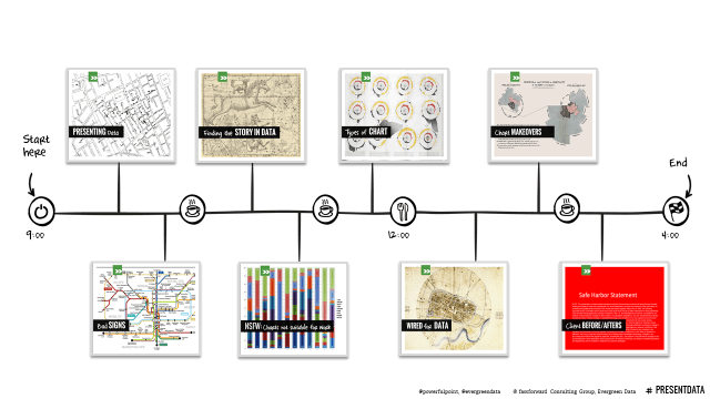
One alternative is to just draw that baby out, in PowerPoint, by inserting lines and brackets and textboxes. You’ll do your level best to place the markers along the line with spacing that represents your actual timeline. This way people can get a better sense of how much is going to be crammed into a short span or how much breathing room there will be between events.
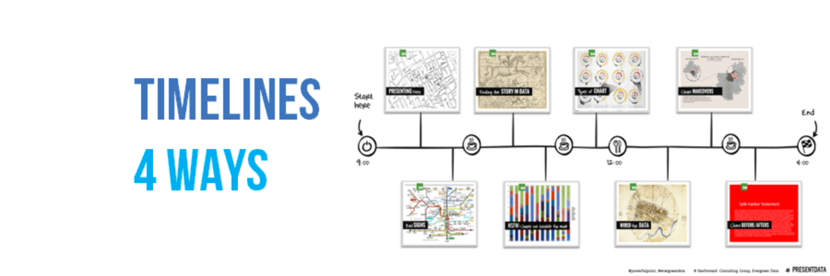
Better yet, replace the text with a picture. In our Presenting Data workshop agenda slides (cohosted by my friends at fassforward consulting), for example, we include a little thumbnail of a slide we’ll speak to in that section. While you can’t exactly lift this idea in whole, you can be inspired to apply the same visual thinking to your own timelines.
Another alternative is to steal from a gantt chart model. Use colored bars to show the span of time you’ll spend on each activity. Great for multiple activities overlapping each other. And of course you can make the visual mathematically proportionate by creating the whole thing inside Excel or using the free Office Timeline plug-in.
And the fourth way, plot that on a calendar. People think in calendars. People’s lives are run by calendars. So give them what they need in a calendar.
And I’m sure you know of other ways to show timelines (link to your examples in the comments!) but please let’s represent the project timeline in a way that matches its importance and becomes a useful tool for the team.


