Slow Reveal
Most of the time I advocate for replacing words with images when presenting slideshows. But sometimes the slide just needs to have a lot of words, like this:
But when we have a lot of words on a slide and we’re truly trying to get people’s minds oriented toward our presentation content, overwhelming their field of vision with so much at once can cause them to just mentally check out (or check their email).
Here’s a strategy for presenting those word-filled slides that can better support audience comprehension – the slow reveal.
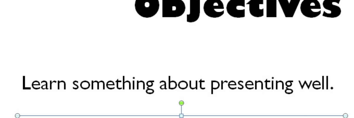
Basically, just reveal one point at a time. You start by constructing the full slide, as I’ve shown above. That slide has 3 objectives plus 1 title, so I’ll duplicate it such that I end up with four slides that look the same. Then, just delete one item from each slide, working backward:
This way, when I start at the beginning and work through the slide deck, I’m presenting just one point at a time. This lets my audience focus on what I’m saying (instead of reading ahead and not fully paying attention). The slow reveal also better helps the audience build the mental concept I’m trying to convey.
So ultimately, I end up with four times the number of slides. But don’t let that scare you. It’s the exact same amount of content, same number of minutes talking.
Hot tip: Make each element on the slide a separate text box. So the final slide shown above has four text boxes (and a star). Using separate text boxes makes it a million times easier to delete individual items so the slideshow can build. I’ve seen people try to keep all the objectives in one text box, while attempting the same type of slow reveal. But keeping them in the same text box often introduces the chance for spacing errors. If just one space is different during the slide build, it’ll totally get noticed (in a bad way). Just use separate text boxes.
Related hot tip: Don’t try to compile it all into one slide and use animation to reveal each element. Animation distracts when you want the audience to focus. Animation is also often slower than anticipated, and sometimes doesn’t work at all in certain webinar platforms. Just use separate text boxes.


