Making Back-to-Back Graphs in Excel
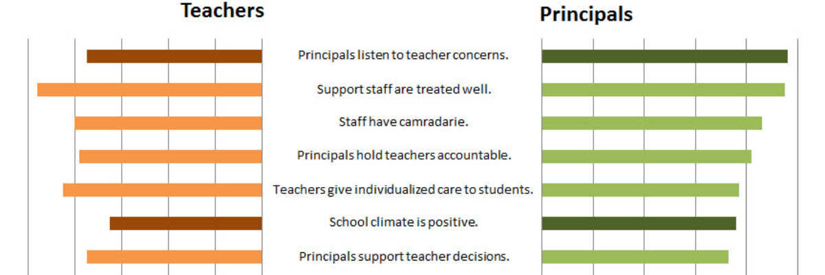
Let’s say we’re interested in comparing how two groups – oh, teachers and principals – responded to a survey. One way to visually display that comparison would be a bar graph, where each question had two bars, one for teachers and one for principals. It’s helpful in some ways, but such a display can make it difficult to also see how JUST teachers or JUST principals responded. And thus was borne the need for a back-to-back graph. It looks like this:

I made this in Excel. It is not a default chart option. It takes little bit of Excel magic skills. Here’s how:
Make two separate, regular ol’ bar graphs – one for teachers and one for principals.
Size them the same and align them.
Here’s a pic of the Principal graph:

This one stays pretty much the same as the default. Just delete the question stems (the y-axis). You click on it to highlight it and then you hit delete.
The teacher graph is just slightly trickier:

Here, to make the bars face the opposite direction, right click on the x-axis, select Format Axis, and then check the box that says Values in reverse order. Delete the question stems (y-axis) on this graph, too.
Now you’ll need to place your question stems back into the graphs:

This just takes inserting textboxes into your Excel spreadsheet and typing in your labels (I used the rare centered justification here). Then you’ll reposition each textbox so it lines up with the corresponding bars.
In this particular graph, I wanted to show questions on which responses were more than 5 percentage points different, so I made them a darker color. I did this by double clicking on the bar I wanted to change and then selecting a new fill color.
So while it seems these are a bunch of different pieces, if you select all of the parts, copy, and then paste as a picture, it will operate as one unit, one fine looking back-to-back graph.
A simpler version of this tutorial and others like it are featured in my book, Effective Data Visualization. Order now.


