
Announcing The Interactive Data Visualization Checklist
If you’ve been anywhere near the world of graph making in the past several years, at some point someone probably sent you the Data Visualization Checklist, developed first in 2014 by me and Ann Emery.
We built the checklist based on the best available research I was seeing via my dissertation work and book writing and the best practices Ann and I knew to be effective from our design work with clients worldwide. It lists out specific guidelines in five areas: text, lines, color, arrangement, and overall – on how to best format a visual so that the data story is clear, regardless of the software used to build the visual. The checklist has been used in practice by thousands of people like you – graph builders, data vizards, chart lovers – in that time.
And while Ann and I piloted the checklist with a panel of evaluators, we never had it formally tested for statistical validity or reliability. Until now.
Sena Pierce Sanjines, a PhD student at the University of Hawaii, has just finished her dissertation, studying the Data Visualization Checklist. She interviewed people like you to understand their thought processes and whether they were interpreting the checkpoints in the way that Ann and I intended when we wrote them. This is a way to test validity. She then trained raters to use the checklist to rate graphs and looked at whether their ratings were consistent – as in, whether the checklist was accurately guiding people to the right rating. This is a way to test reliability. The results of Sena’s validity and reliability testing were so stellar that we decided it was time to materialize a long-term dream:
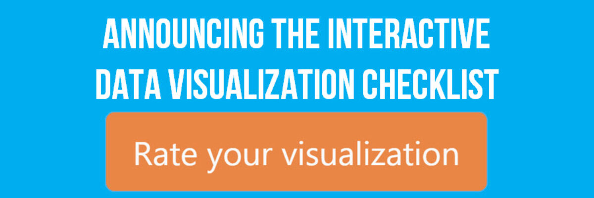
An Interactive Data Visualization Checklist
Upload your visual and the site will walk you through each checkpoint and help you assign a rating.

If any checkpoint is unclear, we have built in illustrative examples. If any rating is unclear, we have included some helpful details so you can discern the right score.

You’ll rate all 24 checkpoints in about 5 minutes or less. At the end, you’ll see your visual’s total score, along with a list of the checkpoints where you rocked it and places where you could improve.
If you aren’t feeling all that familiar with data visualization or how to use this checklist, we also made a short training you can learn from before you get started.
And if you want to read the details on Sena’s findings, we have those technical notes for you, too.
Many people use the checklist as a guidance tool while they are developing a new visual. If that’s the case for you, download a static copy of the updated checklist.
Others use the checklist as a way to assess completed visuals or works-in-progress to see what to fix before publication. If that’s you, try the interactive version.
Training others on data visualization? Use the interactive checklist as group discussion activity.
Deciding on a company data visualization style? Run a few of your recent visuals through the interactive checklist.
Need to convince your boss that data visualization could be improved at your company? Pop one of his visuals through the interactive checklist and post a print out of the results in the break room. I’m just kidding, that could get you fired. Pop one of your own visuals through the interactive checklist and email your results to your colleagues to kickstart some honest conversation.
