How to Make Horizontal Dumbbell Dot Plots in Excel
In case it wasn’t clear, I freakin love dot plots. They are amazingly easy to read, beautifully simple in their display. I was making these babies for some clients a little while ago, before and after dots for about 25 variables in one graph. And they said “Uh, hey yeah Stephanie? Could you, like, draw a tiny line between the pair of dots on each line?” >.< That was my face when I imagined painfully inserting 25 lines, perfectly aligned between the dot pairs. But I love challenges like this. Could I find a way to make Excel do this for me?
Hell yes I could.
Read below for my old instructions. I vastly simplified this process, though, and posted updated instructions here. Use this extra time you now have to go back the world a better place, eh?
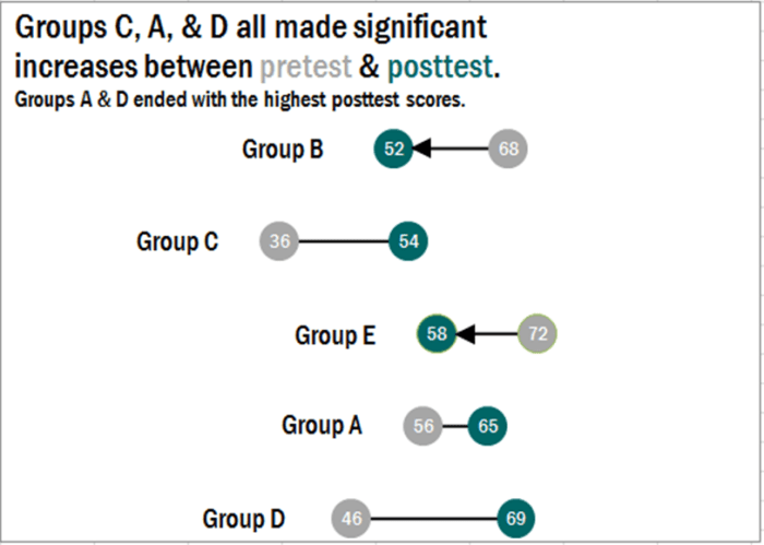
Ultimately, it looked like this:
A regular dot plot is made with a basic scatterplot as its backbone. To make the dots connected, like tiny dumbbells, the backbone is just a connected scatterplot. But the construction is a little bit different. My data table is as so:
 I need a set of y values to accompany each of my x values (the stuff I really care about displaying). Note that I ordered the post scores from least to greatest. Then for the pre and post y values (columns D and E) I typed in values that were .5 apart from one another. This will force each pair of dots to appear on its own line.
So insert a connected scatterplot without selecting any data and then right-click on the empty space and click Select Data. It’ll open up this window:
 Each pair of dots will need to become its own series. So you’ll click on Add to make a new series.
The little window you see above will open up. For Series name, click on the name of the group (Group B). For Series X values, select Group B’s pre and post scores. For Series Y values, select Group B’s pre y values and post y values (Columns D and E). Click OK and then repeat this for each group until they are all displayed on your graph.
It’ll look funky at first.
 You’ll have to go in and carefully change each marker to a circle. Right-click on the markers and click Format Data Series. Up in here, select the Built-in option and choose the one that looks like a sunburst (it’s really a circle) and increase the size to 20:
Change the color of each marker to correspond to your pretest color and your posttest color. Add the labels in the center of each dot. Finally, change the line color away from the Excel defaults. Right-click on either marker and select Format Data Point. In this window:
 Select Line Style from the choices on the left and adjust the width of the line (I ended up using 2 pt). Select Line Color and pick gray or black or something unassuming.
I thought we were good to go but my clients said they’d prefer if we brought better attention to the places where the scores actually decreased. While it would appear that one could simply change the line style in the window shown above such that it began or ended with an arrowhead, in actuality the arrowhead is obscured by this awesome size 20 dot. So I manually inserted a tiny triangle, which wasn’t too painful, especially since we only applied it to a small portion of the dumbbell dot plot pairs.
Add in a sweet title and some textboxes with labels and now we are talking about one heavy-lifting data visualization. Check out a recent report by OHA that uses dumbbell dot plots (I consulted on the design).
AND FOLKS! This is a great example of choosing a graph type that is appropriate to the data. Dot plots are awesome for showing comparisons between two (or sometimes more) points. This would score a 2 on the Data Visualization Checklist item “The type of graph is appropriate for data.”
This is a very early draft of a section now in my latest book, Effective Data Visualization. It has loads of advice on the best chart type to use and how to make it in Excel. Video help is available at the Academy and in The Evergreen Data Certification Program.


