
How to Keep Parents in the Dark
Report card time in the Evergreen household! We have a kindergartener, so this is our first venture into decoding the marks representing his progress. Among other assessments, he’s given a standardized test throughout the year to measure his emergent literacy. Because it looks nothing like the rest of the report card materials, I’m assuming the standardized test company spits out this profile report. I am a newly minted PhD and it took me several attempts, spread a few days apart, to understand what this is trying to tell me:

This is chartjunk, in its finest form.
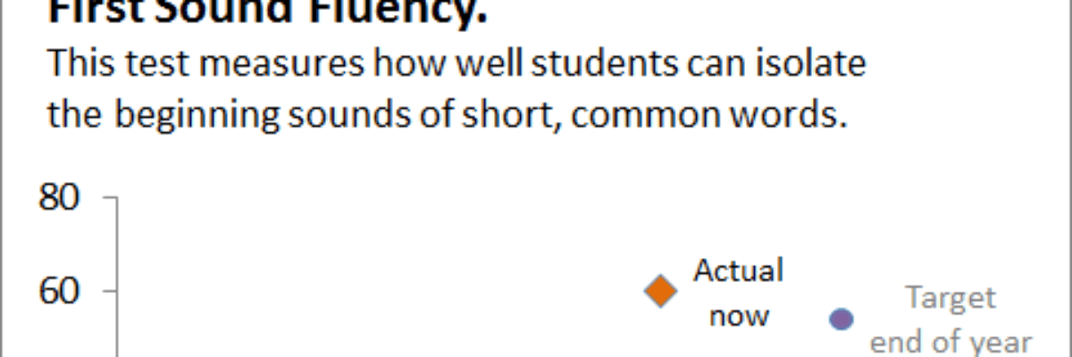
Let’s hone in on one as our example. This is the one in the upper left:

Here’s how I remade that graph:

These are the differences that make the difference:
1. I put the legend right in the graph. Previously, it was too far away.
2. I simplified the language. This test company was speaking test company-ese. I did this too in my first job. I worked the drive-thru (spelled like that) at McDonald’s and I asked the customer if he wanted his drink to be a “16 ounce.” He had no idea what I was talking about, of course. Let’s use language that really matters to people.
3. I added an explanation about what this test measures, right under the title. Again, make it matter to people.
4. I removed the gridlines – just chartjunk there.
5. I made the text bigger. The original version of this document wasted the bottom half of this page. Now, a page doesn’t need to be crammed with information, but trading in more readable text caters to parents.
6. I took out the target bar (why a bar?) and replaced them with actual scores.
7. I took out the months along the x axis. What’s more important is the start of the year and the end of the year.
8. I removed the “progress monitoring assessment” circles. I assume these are the interim tests conducted by the teacher. I don’t really need to know these. These seem more important for the teacher or the school to know. For a parent report, I just need to know where my kid is at each report card, compared to where he’s supposed to be.
9. I removed the word “kindergarten” from the bottom of the x axis. I know my kid is in kindergarten. And it also says so in the information listed in the top left of the page. And under every other x axis.
10. I took out “DIBELS Next” from each y axis. Again, this is listed at the top of the page. Plus, this information doesn’t really mean anything to me as a parent.
11. I eliminated “FSF” from the y-axis. I’m confident this stands for “First Sound Fluency,” which is already labeled in the chart title. Redundancy removed.
12. I added color to each data point to more easily distinguish actual performance from the target. I also assigned them different icons.
13. I grayed out the text pertaining to the start of the year (which I saw at his first report card) and the end of the year, since those are really just reference points.
So I made 13 adjustments and now I’m betting more parents would understand their child’s progress. Sure, it’s a little splashier. Sure, it involves color (but would not necessarily require it, since I also used the icons to distinguish). But this profile report is generated through the testing company software. It doesn’t require extra work on the part of my kid’s awesome teacher. It requires that data companies think more like their consumer, conduct some usability testing, and communicate in ways that people can understand.
