Dealing with potential audience colorblindness isn’t as mysterious as it seems. (And as an added bonus, by way of handling colorblindness, you’ll also fortify your work against the dim bulb in the projector or the color settings on the presenter laptop that skew your established color scheme.)
One product, Color Oracle, can be downloaded right to your computer – it’ll run through your selected documents and show you what it would look like to someone with the various types of colorblindess. (Howeva, I couldn’t get it to download when I tried.)
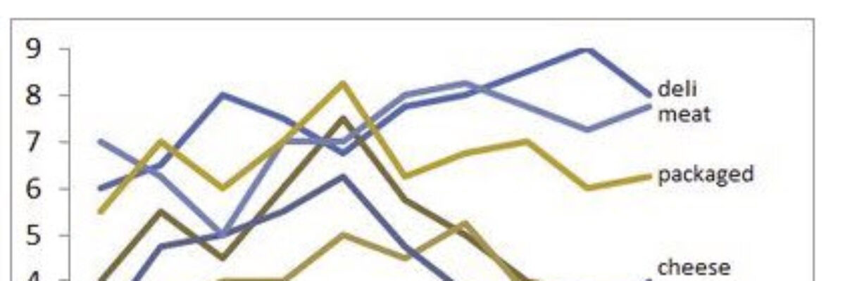
Vischeck can do the same sort of thing online or on your computer. I uploaded a line graph produced with the default Excel colors:
Original:
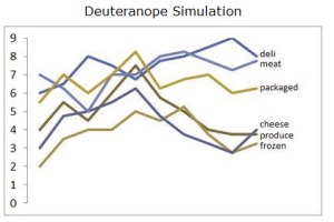
As seen with red-green colorblindness:
This simulated image is pretty hard to follow, isn’t it? All the better to have good legend labeling. Or highlight the most important line with one color and make the rest of them gray. You can handle it.
Here I Vischecked a slide I replicated from all the others I’ve seen that make me cringe. The slide on the right shows what it would look like with red-green colorblindness (deuteranope).
Yeah, that’s terrible. But the original image on the left is pretty bad in the first place! So it isn’t really about the red-green color combination – it’s about the contrast of the two colors. Below I still used red and green to make my original slide, but note how much more readable it is both before and after Vischeck:
So don’t be afraid of color combinations – but do focus on making sure you have a light-dark pairing that will hold up no matter the projector quality, presentation laptop color settings, or audience impairment.


