
Guest Post: Is Feminist Data Visualization Actually a Thing? (Yes, and How!)
[Stephanie’s Note: Social justice and reducing inequality are core values at Evergreen Data. Heather Krause at Datassist shares those values. She is one of the leading voices in discussions around inequality in data analysis and visualization.]
By Heather Krause
How can data visualization be feminist? Data is data — it speaks for itself.
A charming idea, to be sure. But it just ain’t true. Feminist data visualization is (and must be) a thing because data, data analysis, and data visualization are never neutral. The premise that, if handled correctly, data can present neutral evidence, is deeply flawed. Culture is embedded into our data at every stage.
As long as humans have been thinking about data viz, we’ve been projecting our worldview onto it. And that means that, if our goal is equality, feminist data visualization is a very real thing. One we can’t do without.
The God Trick
Objectivity is important in science. But as we’ve said, data is rarely objective. Donna Haraway talks about “the God Trick” —the (mistaken) idea that we can look at data with an unbiased “view from nowhere.”
“(Feminists) need the power of modern critical theories of how meanings and bodies get made, not in order to deny meanings and bodies, but in order to build meanings and bodies that have a chance for life.”
Donna Haraway, Situated Knowledges
Still, if we are careful to use data viz best practices, we should be able to convey what we know with a modicum of objectivity, right?
Not quite.
How We Interpret Data Visualization
Kennedy Elliot of the Washington Post spoke at last year’s the OpenViz Conference, where she discussed whether data visualization is a science or a language. In her talk, she cited 37 of the most influential studies on viz and how people interpret graphics — many of which are the basis for best practices today.
But only two of those studies included any participants outside of North America. All of them were conducted in English. The vast majority used students at expensive colleges as their subjects.
Do you see the problem?
All of those studies were run — and participated in — by people likely to share a common worldview. So chances are the best practices they produced only apply if you (or your audience) share that context.
Different Contexts Need Different Viz
Data visualization needs to reflect the culture that it lives in. This includes the culture the data came from as well as the culture of the intended audience. When designing data, a few of the many dimensions you need to think about include power distance, collectivism/individualism, and relationship to time.
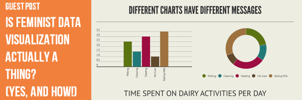
A few years ago, we worked with a team in Bangladesh on a project aimed at helping low-income dairy farmers improve their productivity. But problems arose when we realized many of the women we were working with were illiterate, and could not understand the graphs we showed them.
We did extensive RCT research on how different cultures view data. Our discovery? Cultural context matters a lot when it comes to data viz.

While the women could not read the chart on the left at all, they understood the chart on the right clearly. When we talked with the women about why they preferred the chart on the right they were quite clear that their ideas about time were much more closely related to cycles than lines. The less linear interpretation of time was more culturally relevant to the people who were both producing and interpreting this data.

We received the opportunity to partner with Aboriginal groups in Canada to do some data work and it was this experience that educated us on the cultural importance of power distance. We looked at a traditional national statistics bureau style visualization of education over time, spanning the years 1996 through 2011. To many, this seems like a long time. Charts like this often reflect the length of time “comparable” data is available. Up to this point, I had usually assumed that this was enough.

When we dug deeper into the historical data held within the groups that were being defined in the chart, however, this is the chart that emerged. This time period is more meaningful to the cultural setting. This time period also centers the power of data creation and ownership in the relevant culture.
The Solution: Feminist Data Visualization
Catherine D’Ignazio is a leader in feminist data viz. She suggests that feminist data visualization offers a more responsible solution:
Feminist standpoint theory would say that the issue is that all knowledge is socially situated and that the perspectives of oppressed groups including women, minorities and others are systematically excluded from “general” knowledge.
We simply can’t make data viz completely objective. But feminist data visualization can help us take ownership of the claims we make with data — rather than simply shrugging our shoulders and pointing at the numbers. D’Ignazio offers three key ways we can make viz design more inclusive:
Come up with new ways to depict the limitations of a visualization.
Data viz conveys the data we have. Ensuring it also communicates missing, excluded, or out of range data can provide valuable context. Designers should verify the data they visualize and make efforts to find out why missing data is not present.
Reference the material economy behind the data.
I’ve discussed the importance of this in posts on data biographies. Making clear how data was gathered, who collected it, who funded the collection, and why it was gathered provides critical insight.
Facilitate dissent.
We often present data viz as fact — or at very least, the determination of an expert. Allowing your audience to question the data or present alternate views ensures inclusivity and democracy.
Data collection, analysis, and visualization are not neutral. All we can do is be honest and ensure we are transparent about our choices and limitations. If you need help with feminist data visualization, the team at Datassist can help. Contact us today.
