Easy Dot Plots in Excel
A while ago I was at a Naomi Robbins’ workshop and she was pretty emphatic that dot plots are the better method of visualization, as compared to bar charts. The reason goes back to Cleveland’s early experiments on visual perception, which found that humans most accurately interpret locations on line, when those lines share a common axis. Even more accurate than length, which would be a bar chart.
The problem is that most of us use Excel and dot plots are not a default chart option. On Naomi’s inspiration, I used a little elbow grease to make it work. Here are the instructions. And I think you’ll agree that the dot plot really does allow for better comparison between two points over a side by side bar.

My data table looks like this. Fall and Spring columns hold my actual values (kindergarten readiness scores). The DOT SPACING values are just my placeholders. They’ll put the Fall and Spring values on evenly spaced lines.
First I select “Fall” and it’s values and “DOT SPACING” and it’s values and then insert a scatterplot.
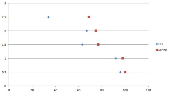
Doing so produces something like this:
Then I right-click on the graph, choose Select Data. I edit the name of this series so it points to the cell with Fall.
Then I add a new series and select the Spring data for the x axis and again select DOT SPACING data for the y axis. That produces this graph:
And format each data series (right-click and select Format Data Series) so that the marker size is larger, more like 20. I change the reference point (Fall) to a gray color and I change the most recent point to my action color (red).
Then add data labels (right-click and select Add Data Labels). Right-click again and select Format Data Labels. Change the settings there so the labels display the x values, are centered over the data point, are white, bold, size 14 or so. Those adjustments bring us to this chart:
 Finally, adjust the y axis so the top line is gone. Just change the maximum number on the axis to the highest number you have listed in the DOT SPACING values. Then delete that axis.
Also adjust the x axis as needed (mine needs to stop at 100).
Then add a title and subtitle.
Labels are trickier here, so I just inserted textboxes right over the chart. Here’s my final product:
 So the key is to set up a hidden y axis of spacer values that serve only to put your data points on lines that are evenly spaced apart from one another. Other people also have methods for forcing a dot plot out of Excel – this one is really easy and totally free. Give it a try. It really does support comparisons pretty well, and would even if the number values weren’t displayed. Good luck!
This post is the very first draft of an excerpt from my latest book, Effective Data Visualization. It has loads of advice on the best chart type to use and how to make it in Excel, including simplified instructions.


