I get the lucky privilege of working with the president of the American Evaluation Association on his or her keynote slidedeck. I love this small project each fall for a couple of reasons. Thus far, the presidents I’ve worked with have been wicked smart and eager to see the field grow and working with clients like that rocks. Also, they readily admit they need help with their slides. This year, I collaborated with Jody Fitzpatrick.
We were starting from scratch – no existing slide content to have to reshape. So I asked her to rough out her content on each slide, as she normally would, but without especially trying to make it look pretty.
Here’s what one of her slides looked like when she sent it to me:
Pretty typical, don’t ya say? And, no offense to Jody, super common among those working in academia: lots of bullets, lots of text.
To reboot this slide, I needed to build in some graphic elements. I wanted the slidedeck to echo the president’s graphic theme, usually first launched via the conference program cover. My friend Chris Metzner makes the cover, so I asked him for the original graphic file, which was a picture that looked like an up close shot of a purple sequined dress I’d love to wear for New Year’s. You’ll see here that I cropped out a rectangle of that image and used it as the background for the slide’s title space area.
Then I broke the slide into its atomical parts, so that I presented just one idea per slide (expressed in the original as separate bullets). Doing so keeps the audience engaged because we don’t overwhelm their working memory with a ton of information and cause them to space out.
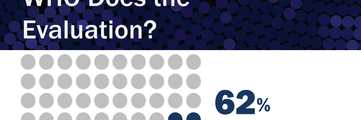
Next I needed to graphically represent that one idea for this slide. I also wanted to work with the visual theme so I expressed the one idea – 62% of nonprofit eval is done by a nonprofessional – as an icon array. These are simple ways to show parts of a whole or to express a percentage using a repeated shape. Easy here, because I could echo the circles that appear in the sequin graphic. I made 1 circle, roughly the same size and shape as in the picture at the top and then copy and pasted it so I had 100. Then I changed the color of 62 to a blue that matched the sequin graphic.
Here’s another original slide Jody sent me:
You’re probably thinking “yikes, boring! Time to check Facebook!” and you’re right about that but I’m also thinking “What a really interesting piece of info about my field that’s totally not going to get noticed!” So first I put the sequin graphic behind the title. And while there are tons of ways to depict “one in four” I went with the circles again, in keeping with the theme.
It’s like a giant version of an icon array. Usually, graphic designers try to avoid putting words in circles because words tend to be squarish or rectangular and they don’t fit well in circles. It plays out okay in this slide because the words in each circle are smaller. One trick is to place the word vertically lower than the actual midpoint. This is most pronounced in the circle with “out” – see how its not in the perfect center?
The “and liked it!” appeared when Jody clicked, adding some levity to the talk. It also translated a more clinical term like “very satisfied” into something more tangible. Notice that I additionally emphasized the humor by using the action color (blue) on it and apply the heavy version of the font (Franklin Gothic).
Your Takeaway Hint: In many ways, coming up with the graphics for each slide was pretty easy because I wanted to remain loyal to the president’s purple sequin disco ball theme that I love so much. Using that graphic, I had colors and shapes handed to me. No more toiling over the development of each visual!
Want more like this? Check out my reboot of Rodney Hopson’s slides last year. In addition to the presidential keynote, I rebooted 5 slides from 5 of AEA’s top workshop presenters and posted the before-and-afters at Potent Presentations Initiative. Navigate to Slides>Fab Five Reboot and then pick a name to see the makeover.
And speaking of slides, I’m giving a webinar on Nontoxic Slideshows on December 17. Can’t make the 1pm ET time? Register anyway and I’ll send you the recording afterwards.
Oh, it’s the last post of the year, folks! See you in 2014!


