Atomic Slide Development
Seth Godin recently published a blog post on the atomic method of creating slides. He put into words what many of us have felt about the overuse of bullet points. But more than talk about it, he detailed a method for actually moving from a typically bullet-pointed slidedeck to one that better supports audience attention and comprehension.
I demonstrated this process at a recent conference, like this:
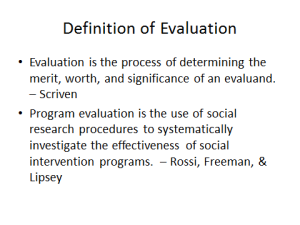
So, one starts with the typical slide, full of typical bullet points, looking something like the one below
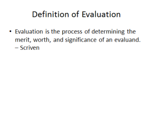
Then, in the next step, one would separate the bullets such that there is only one per slide. It’s a simple copy and paste – no extra content, just more slides. Below, we’ve got just the first bullet point.
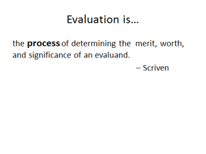
I deviate from Godin’s method here and suggest that one reviews the slide to see how many words can be taken out while still holding on to the meaning. There’s a redundancy above we could remove. Also, one might choose to highlight what one finds to be the most important part of the message. See below.
We can probably still remove some text from the example above. And add a few elements that will help drive the message home, like this:
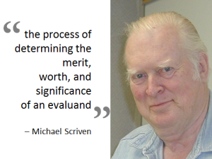
Since the original idea of the first slide was to compare definitions of evaluation as given by different scholars, it is probably pretty important to link those definitions with the authors in a visual way. Hence the need for Michael’s photo, which I borrowed from the Genuine Evaluation blog.
And depending on what one wanted to explore in this fake talk on evaluation, one could probably break this slide down into its atomical parts even more. An example is shown below:
This way one could better explore what Michael means by merit, worth, and significance – and help the audience better retain the information along the way.
So atomic development is one idea per slide. We break a slideshow down to its most basic particles by removing the nonessential text and simplifying the slide content to what will make the biggest impact on memory.


