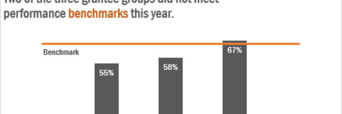
Adding a Benchmark Line to a Graph
This simple line packs so much power. Adding a benchmark line to a graph gives loads of context for the viewer. Here’s how to make one right inside Excel. It’s so easy you might pass out.
My data table looks like this:
I have my data and I have the benchmark value listed next to each.
Highlight the group names and their data and insert a simple bar graph:
Then right-click on the graph and click Select Data. In that box that pops up, click the Add button to add a new series. In *that* dialogue box, select your Benchmark data. It’ll look like this, but don’t freak out:
 Now it’s time to move that benchmark data from bars to a line.
In Excel 2013, I right-click on the orange benchmark bars and click Change Chart Type and then choose Line. You can do this in 2010, too, just click on the benchmark bars and then click the Change Chart Type button in your Layout tab and select a line graph. (This is a good time for me to mention that if I ever open a pub for data nerds, I’m going to call it The Benchmark Bar.)
I also added the word “Benchmark” to the line by adding a data label to just the left most point. Of course, at first Excel tried to give me the value of the point, but just right-click on the point again and click Format Data Label and then select Series name and unselect Value.
So this is cool but if you’d like your benchmark line to be a bit longer, you can just fiddle with the data table a little and select blank cells to add some space to the set of bars and associate the benchmark 65% with each blank spot. Did that sentence make any sense? It was heavy on the nerd-speak. Just make it look like this table here:
And now the graph is WAY more powerful! We’ve added so much interpretation to the data visualization, helping the viewer understand how far the first two groups are from the target and by how much Group C exceeded it. See a benchmark line in the wild in this dashboard report from Oregon Health Authority (scroll to, like, page 10). And think of other ways you could use this line, such as for targets, averages, national standard, yes keep dreaming!
This is *exactly* the kind of thing we were referring to in the Data Visualization Checklist when we said “Contextualized or comparison data are present.” Yer viewers want to be able to interpret the data – is it good? bad? the worst in history? best in the nation? A benchmark line gives that necessary context. BOOM!
This post is an excerpt from my latest book, Effective Data Visualization, where I even SIMPLIFIED these instructions. It has loads of advice on the best chart type to use and how to make it in Excel.


