
That dashboard you’ve been developing? That one that’s cost hundreds of hours and thousands of dollars? Wanna know why it doesn’t have the leverage you thought it would?
It shoulda been a webpage.
Don’t scream.
Hear me out first.
Then propose this change to your boss.
Who’s gonna see you as a freakin *genius*.
Then, send me an I’m-sorry-I-doubted-you-thank-you note.
I’m already drafting you a pre-emptive “you’re welcome, boo.” 😘
Here’s a perfect case in point to share with your team.
My clients at the National Education Association published this webpage. It’s long, so I’m going to include snippets in this post and link you to the whole thing, which you really should see, here.

They’ve smartly titled this thing with a catchy (you could say “click bait-y” if you wanna be judgy – doesn’t matter much cause this works) 6 Charts that Explain the Educator Shortage.
Think about this: if you title any data communication – dashboard or otherwise – with something like “5 charts that explain our sales drop” or “7 charts that explain our amazing year” and your higher ups are gonna click. Period.
We don’t think of this kind of phrasing for dashboard titles.
We get into this copywriting mindset when we’re thinking about webpages, journalism, and storytelling.
Shifting your communication platform shifts your thinking.
And shifting to a webpage makes you think about the rest of the words, too. Webpages don’t just have a title. They have narrative.
Here’s one snippet from the NEA’s page:
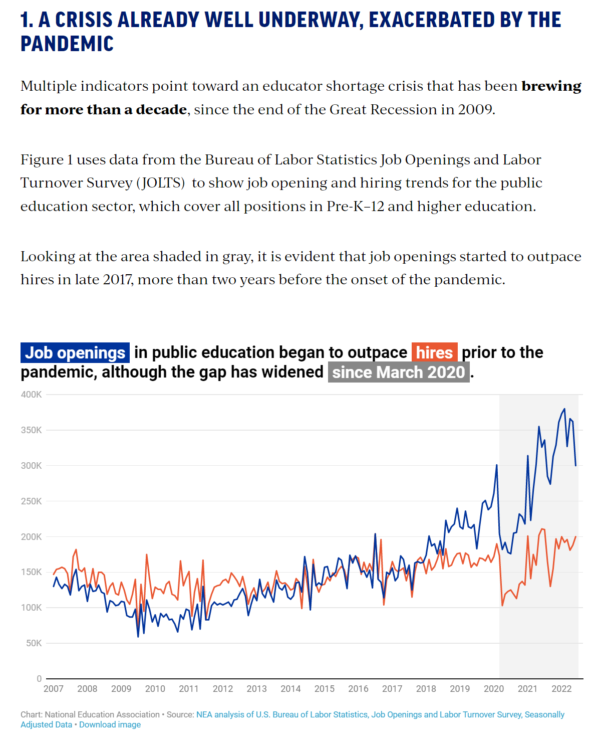
Good looking graph, right? Awesome, color-coded title. Solid chart choice. Smart design. No complaints.
But what makes this into an actual story is the accompanying narrative between 1. and the graph.
And that’s the stuff you don’t get in a dashboard.
That narrative is where you get nuance. Expansion. Explanation. Clarification.
When we think in dashboard, we often constrict ourselves to the canvas size that our dashboard software has laid out for us.
In Tableau, that’s 1,000 x 800 pixels.

In Power BI, you’ve got 1,280 x 720.

And, too often, we don’t question those constraints. We just cram within them.
A dashboard of the 6 NEA charts would look like this:

Sure, the titles and graphs are so strong you can get a story out of it. But it’s tiny. I have to pinch to zoom.
It isn’t the full, detailed picture.
And, frankly, doesn’t it feel a bit… tight? Full? Dense?
Thinking like a webpage makes you balance out the text and the chart. Never so much text that you’ll get bogged down. And never so many visuals crammed into one spot that you get overwhelmed.
Thinking like a webpage brings some balance to your storytelling.
Here’s the thing: You’re probably already publishing your dashboard and sending around a link, right?
That part doesn’t change.
This strategic approach to your data communication just brings you more utility. It makes your work more accessible. Because the dashboard version requires a ton of background info that only a select group is going to have. People need that background scoop to fully understand the charts, if all they’ve got are the charts.
You bring more people into your audience when you think like a webpage and explain your data.
Now please, PLEASE, do not write me defensive emails saying that this can’t possibly be done when your data are interactive and dynamic. I’ve heard the question so many times: How can I have narrative if my audience can filter the view?
My dear sweetheart, that’s the same restricted-by-the-platform thinking that’s made our dashboards fall short all this time.
Of course your narrative can change if your view changes. We show you how in the Data Viz Academy.
The default canvas in Tableau and Power BI aren’t setting you up for success. But the default canvas isn’t as creative and smart as you are. Let me help you think bigger.
