I have the coolest gigs. Every year I get to work with the Eleanor Chelimsky Forum keynote speaker to develop a slidedeck that rocks the house. This year, the keynote speaker was Abe Wandersman. I’d seen Abe present in the past and… let’s just say I knew I would be in for some hard work. Smart guy, helpful info, subpar slides.
Por ejemplo, here is one of his original slides. He’s talking about accountability and using a quote, in which he asks the audience to guess the quoter.

Fine enough, I suppose, but why not punch this up a bit with:
- More interesting fonts that will help create a dynamic that better emphasizes his point.
- A picture of the quoted.
- Some color for Pete’s sake.
So I made this:

And it was animated such that Dr. Sebelius’ pic and name came up after Abe teased the audience for a minute. Dynamic. Interesting. Engaging.
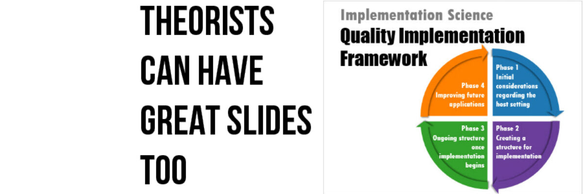
Another example: Abe was talking about the 4 phases of implementation science.

You don’t have to know anything about that topic whatsoever to recognize that Abe’s original slide included perhaps the most common academic slidedeck sin, copy/pasting a diagram from a paper into a slide. Not only is the graphic blurry, it has this adjacent content that is just way too much text for a slide. No one wants to or even could read that.
Better option: Take approximately 10 minutes to recreate the main diagram inside PowerPoint.

With PowerPoint’s graphic capabilities, the figure is crisp and clear, can be made larger or smaller, and crops out that extra text that doesn’t belong on the slide. Where does that extra text belong? In Abe’s mouth. He still conveyed all of those points but the value was housed in Abe, the genius, rather than the slidedeck. And yes, we animated the slides such that each quadrant appeared one at a time, as Abe turned the verbal page.
The relatively small investment in consulting time with me paid dividends to Abe because he landed safely with a rockstar visual support for his keynote at the Chelimsky Forum, a speaking engagement that is recorded and broadcast for the whole world to scrutinize. Abe comes off even more intelligent and charismatic and persuasive.
You *might* be okay with some plain and generic slides when your talk is small candy but when the stakes are raised you will end up looking ever more the professional when you invest a bit of time in your slide design.
You truly can do this yourself. Download my Qualitative Chart Chooser if you need even more ideas.
