“I vote no.” This short answer speeds up the dashboard development process significantly. And I developed the question my client voted on in roughly 3 minutes, by showing her a quick sketch of some possible graph options.
My client is in charge of a dashboard that tracks how high school students in Mississippi apply for college financial aid. She built a simple dashboard in Tableau but brought me in to refine the design and rethink the graph types.
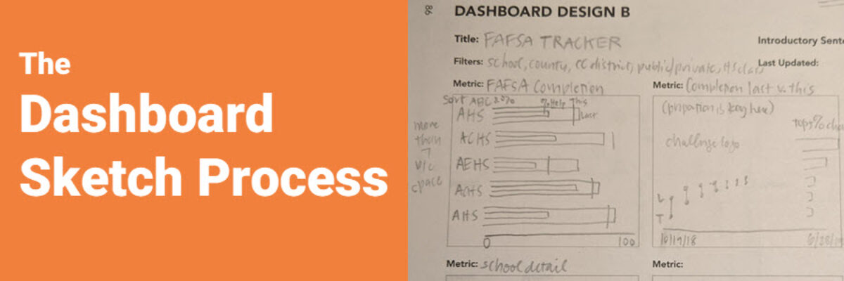
In total, the dashboard had 5 metrics. So I used a page from The Data Visualization Sketchbook – the dashboard template with space for 6 metrics – and I sketched out what I thought the 5 graphs should look like.

In the sketching process, I realized I had outstanding questions like “where is the data for this metric?” Tiny stuff, you know 😉 And I made note of what to ask my client in our next email.
This stage of the sketching process was strictly for me, to help me get organized. It took me 15 minutes. I emailed my list of questions to my client and opened Tableau to build everything else.
Most of the metrics are simple, just showing change between two years, sometimes with associated benchmarks each year. There are LOTS of ways to visualize this kind of data. So as I’m thinking through the logistics of building the primary graph for the dashboard, I realize that I want to provide the client with several options of graph type, so she can decide which one is easiest for her to read. But some of the graph options I want to show her require a total overhaul of their in-office workflow, completely changing how they plug the data into the Tableau data source. My goal with dashboard development is never to make the work life of my client more complicated afterwards.
Before going down that path, I whipped out The Data Visualization Sketchbook once more and turned to a graph grid paper page. I sketched out the four graph types I was considering and sent a pic to my client, along with notes about each graph type’s readability and implications.

This time, my sketching was for quick feedback from the client, before I sunk time into data manipulation processes that they might not even desire.
She replied within the hour with this:
Graph 1: I really like this idea.
Graph 2: Works.
Graph 3: I vote no.
Graph 4: I would rather not use this one either.
AWESOME! Two possibilities she likes. One of which does NOT require major rearrangement of their workflow. Decision made. Onward.
And this is exactly why I published The Data Visualization Sketchbook. Because sketching saves so much time and money. We iterate through options and land on the right answer so fast.
