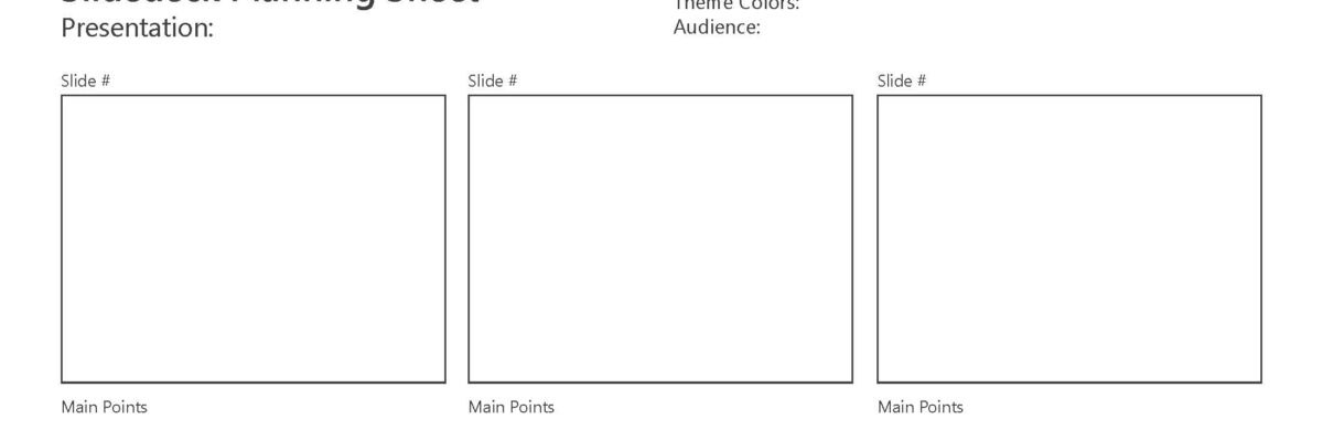
Holster that mouse! Before you crack open PowerPoint to crank out some slides, take a step back and sketch. Your time in front of the computer will be far more productive (as in, you’ll save hours roaming stock photo sites) if you think through your slides on paper before you…
slideshow
Organize your Reporting with a Style Sheet Template
Dudes, I know report writing is no small task. It takes lots of people working on different parts – sure. But so often I see reports that look like they’ve been Frankensteined: different fonts and colors in each section, barely stitched together into a cohesive whole. One way graphic designers…
Lessons from a 4th Grader’s PowerPoint
A son of friends, we’ll call him Avery, was tasked with every 4th grader’s nightmare – prepare and deliver a presentation on one of the US states. When I was in 4th grade, we didn’t have PowerPoint or wikipedia. I think I made a poster that includes pictures clipped from…
Your Brain on Slideshows
Here’s what happens to audience brains when presenters speak while showing text-heavy slides. Their working memory gets overloaded. Working memory is that part of the cognition system where we contemplate information, wrangle with it, try to digest it. But working memory has limits on its cognitive load. It can only…
Successful Webinar Presenting
I host or give roughly 70 webinars a year, most over with AEA and others right here at Evergreen Data. Here’s what I have seen that makes for a good webinar presentation experience (as opposed to presenting the same content in person). Use a faster pace.
Top Four Mistakes Seen in Conference Presentations
With my book manuscript and an edited volume of New Directions in Evaluation (on dataviz) due this Friday, this week’s blog post is a repost from an original article I wrote for Presentation Magazine. My background is a garbled mouthful: interdisciplinary program evaluation. What does that even mean? It…
Presenting Graphs with the Slow Reveal
Over here I talked about how important it is that we gradually introduce components of complex graphics – one-at-a-time – so as not to overwhelm the visual field and working memory of our audience members. We don’t want to slam our content in their faces all at…
Slide Redesign: Rodney Hopson’s Keynote
I had the joy of working with Rodney Hopson, 2012 President of the American Evaluation Association, on the slides for his keynote talk. The transformation was so huge that I asked Rodney if I could write a blog post about it and the thinking we put into the new design.
Before & After Slides: Stay on the Side of Simplicity
My friend, Kurt Wilson, and I just wrapped up a contract to revise a set of slides – and the graphs within – for a big international client I can’t name. Here I’ll walk through one of the original slides and our revision of it. Keep in mind that these…
Bleeding your Presentation
It’s time to talk about bleeding. Bleeding is a technique used by graphic designers in which the image extends all the way to (or even beyond) the edges of a page or slide. In the slide below, the image is not bleeding. The picture of the tractor is…